Texas A&M Football
Sponsored by

Letter to the Leadership of Texas A&M regarding the Bevel

251,976 Views | 1739 Replies | Last: 4 mo ago by RealMcCoy09
Old Main
How long do you want to ignore this user?
AG
ElephantRider,

We are talking about the Classic aTm logo on the FOOTBALL helmet, of course the A&M Football forum is the best board for this discussion. Plus it is the offseason after all.

[This message has been edited by Old main (edited 4/15/2013 8:33a).]
Quad Dog
How long do you want to ignore this user?
AG
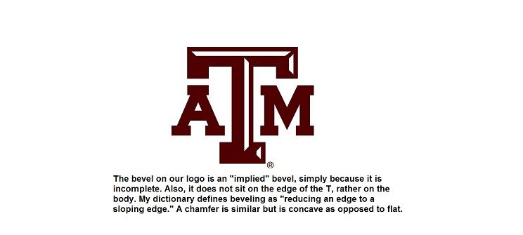
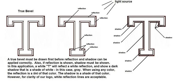
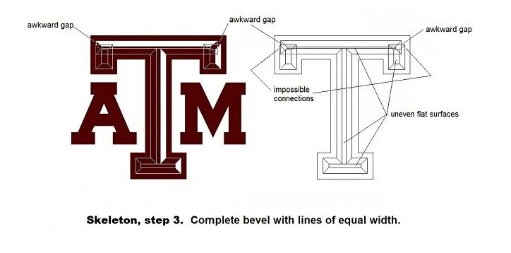
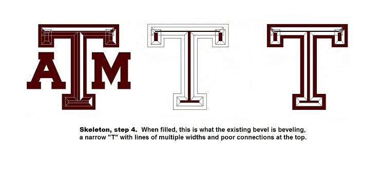
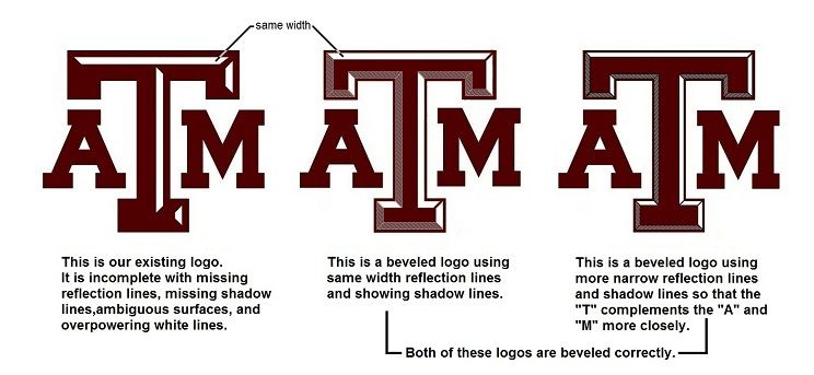
Nice post and letter Old Main. I completely agree with you that the bevel is bad for many reasons. If a designer wants to accent the T there are many ways to do it that would be better. Such as an outline, drop shadow, or a correct bevel. The current incorrect, half bevel we have now in unacceptable.
Unfortunately the polls and anecdotes you referenced in the letter might have been misplaced. They are nowhere near representative enough to matter. Same for arguments about sales, there are so many other factors that go into sales. Such as wins, advertising, and amount shown on national TV. I think your points and examples about it being a difficult logo to reproduce on merchandise consistently were good ones. I think your (and my) arguments against the current bevel from a design and merchandise stand point are strong enough to not need the other ones that are more flimsy. But maybe they will inspire someone in the right place (some A&M merchandising guru) to do an actual study on fan opinion and impact to sales. But any designer will tell you that fan opinions don't matter much when designing a logo. If you are trying to make all the fans happy, you never will. I say we go with a classic logo that makes geometric sense. If that includes a bevel, fine, but make it a good one like the ones you showed in your letter.
wtr1975
How long do you want to ignore this user?
AG
Someone seriously needs to consider "getting a life."
sawemoffshort07
How long do you want to ignore this user?
AG
Down with the bevel
ajthomas
How long do you want to ignore this user?
AG
agree with the op on the bevel.
Scientific
How long do you want to ignore this user?
AG
Just use the logo we have on our helmets, and call it a day. Nice and clean. Its why i love our helmets.
Brick Tamland
How long do you want to ignore this user?
I swear some people would not even post on TexAgs if it weren't for the bevel argument. It's not going anywhere any time soon, whether we like it or not. End of story. It does not matter if it is "correct" or unpopular.

Here's why I want to keep the bevel:
A) It is everywhere already
B) It gives the A and the M a little more chance to stand out. When I see the block logo, all I can focus on is the T. We aren't "Texas", we are "A&M".
C) It would look good with our beveled numbers
D) Other schools around the SEC are looking up to A&M as a marketing leader. The bevel is part of our marketing.
E) It is recognizable
F) It does not matter what our logo looks like, as long as it has aTm on it, people will buy the hell out of it.
G) Look at our logo that ESPN uses. Maroon square, white aTm, grey bevel. Looks outstanding! It's a nice accent when it does not take up the whole T like our maroon logo that has been at midfield the last few years. (Not to be misunderstood as me not liking the bevel. I just personally like the white logo with grey bevel.)
H) Old Main hates the bevel (just messing, big guy)


Whether or not you agree with any of these, I do not care. This is my argument to keep the bevel, since someone said that nobody has argued to keep it. Just my opinions. Old Main has his, I have mine. He presented his, now I am presenting mine. No personal attacks here. Carry on.
jackalope05
How long do you want to ignore this user?
AG
quote:
No personal attacks here. Carry on.


Well that's no fun
Brick Tamland
How long do you want to ignore this user?
I just meant in my post
Street Fighter
How long do you want to ignore this user?
AG
quote:
You should give him some respect, he and his grass roots efforts are like 33.67% of the reason we are in the SEC!


You can't be serious.
ElephantRider
How long do you want to ignore this user?
AG
quote:
No personal attacks here. Carry on.

Tell that to rocky the poopoodog
javajaws
How long do you want to ignore this user?
AG
If the bevel ever gets removed I hereby nominate that Old Main's handle by renamed by Texags staff to "Bevel Slayer".
rocky the dog
How long do you want to ignore this user?
AG


[This message has been edited by rocky the dog (edited 4/15/2013 11:00a).]
rocky the dog
How long do you want to ignore this user?
AG
Rider, I apologized and removed my insult. How about you?
ElephantRider
How long do you want to ignore this user?
AG
I'm just messing with you bud. I didn't take it seriously (it was the word doodoo after all)
Brick Tamland
How long do you want to ignore this user?
As said in my post, who cares if it is "correct"? It is the logo we are using and I highly doubt they are going to change it just because someone drew a bunch of lines in AutoCAD. It is fine how it is. The incessant *****ing over the logo is what is driving it to not change. We have made tweaks to the logo every few years, whether it be the size of the T, the A and the M, the alignment of the letters, etc.
rocky the dog
How long do you want to ignore this user?
AG
Rider,

No big deal. I guess I have to live by my own addage, "if you can't take it, don't dish it out."
TexasAggiesWin
How long do you want to ignore this user?
S
quote:
Alright, I apologize. It's just frustrating that a former student posts a letter trying to get his alma mater's logo correctly presented, is ignored by the University, proves it's flawed, and gets personally attacked by people who think it's trivia. He's entitled to his opinion about the logo, but then has to endure derogatory opinions about him. I just don't think that's right.


JJxvi
How long do you want to ignore this user?
AG
BTW, just so some here will be familiar, this is no longer an athletic department thing. This is a University wide unification of identity that has been going on for a while.

Example...

http://dmc-assets.tamu.edu/brandguide/images/Loftin-letter.pdf

[This message has been edited by JJxvi (edited 4/15/2013 11:12a).]
TxAg76
How long do you want to ignore this user?
AG
absolutely superb, OP
Towns03
How long do you want to ignore this user?
AG
The bevel is busy trash and I fully support the letter in the OP.

[This message has been edited by Towns03 (edited 4/15/2013 11:33a).]
jackalope05
How long do you want to ignore this user?
AG
Correct bevel looks badass
rocky the dog
How long do you want to ignore this user?
AG
quote:
Correct bevel looks badass


And that's all we are asking...do it right or don't do it at all.
ElephantRider
How long do you want to ignore this user?
AG
I actually prefer current bevel to "correct" bevel. I'd prefer neither but it's still not a big deal to me at all
Brick Tamland
How long do you want to ignore this user?
For what it's worth, Loftin has a different bevel pattern on his golf cart.
Clever&FunnyAg
How long do you want to ignore this user?
AG
How on earth does the OP have that much time on his hands. If I had that much spare time, I wouldn't be writing letters to the A&M administration about the bevel.
jackalope05
How long do you want to ignore this user?
AG
I really don't think many people would know what you were talking about if you asked them their opinion. Just my 2 cents
Scientific
How long do you want to ignore this user?
AG
quote:
B) It gives the A and the M a little more chance to stand out. When I see the block logo, all I can focus on is the T. We aren't "Texas", we are "A&M".

So we're just A&M? I guess we ought to eliminate the T altogether, and make everyone happy.
p-wonk01
How long do you want to ignore this user?
12thDude
How long do you want to ignore this user?
AG
Down with the bevel!
Brick Tamland
How long do you want to ignore this user?
Scientific, I'm just saying that in my opinion that with the bevel we see the A, T, and M better instead of a big T with the A and M in the background.
Scotch
How long do you want to ignore this user?
AG
One reason given for the creation of the bevel is that they were trying to highlight the T.
7thGenTexan
How long do you want to ignore this user?
AG
Brick,

Cook has said the bevel is there for the opposite reason. It's there to emphasize the T. That's the closest he's ever come to an explanation at least.
Scotch
How long do you want to ignore this user?
AG
quote:
G) Look at our logo that ESPN uses. Maroon square, white aTm, grey bevel. Looks outstanding! It's a nice accent when it does not take up the whole T like our maroon logo that has been at midfield the last few years. (Not to be misunderstood as me not liking the bevel. I just personally like the white logo with grey bevel.)
So as I understand it, you like the bevel when the it doesn't stand out(white T, light gray bevel), but not when it is a contrasting color that makes the logo look busy. This is the view of most of us who don't like the white on maroon and maroon on white bevels! The gray on white is MUCH better, as I stated in an earlier post on the thread.
The white on maroon is too busy and causes unintended consequences such as having a floating "T" on a sign on the outside of Blue Bell Park because only the white bevel shows up. The proper choice for the sign would have been a white TAM(gray bevel or not) on a maroon background.
pinche gringo
How long do you want to ignore this user?
AG
I would support a white bevel on a white T
 
×
subscribe Verify your student status
See Subscription Benefits
Trial only available to users who have never subscribed or participated in a previous trial.