Just like his military walk prophesy. Spot on.
Letter to the Leadership of Texas A&M regarding the Bevel
251,966 Views |
1739 Replies |
Last: 4 mo ago by RealMcCoy09
For the love of god kill this thread
20 bucks says Old Main is the "anonymous" poster in there
$20 that the bevel is here in a year :-)
It ain't going away. It's like ol Clayton Williams used to say, "might as well enjoy it"
-GIG'EM!!
It ain't going away. It's like ol Clayton Williams used to say, "might as well enjoy it"
-GIG'EM!!
http://boards.sportslogos.net/topic/49485-new-texas-am-logo-may-have-been-leaked
People disliked the Bevel back in 2007. This is from a sports logos forum.

[This message has been edited by Old Main (edited 5/4/2013 11:10p).]
People disliked the Bevel back in 2007. This is from a sports logos forum.
quote:
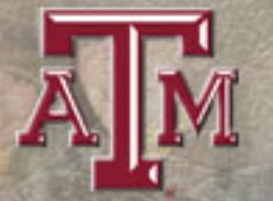
A new Texas A&M logo was discovered on the corps website. Its similar to the old logo, but the A and the M are slightly larger and this has to be the ugliest attempt at beveling i have ever seen. I dont know what the hell this is, if it official, or what. If this is actually the new logo, i'll be pissed.
quote:
Ugh. Is there something wrong with block letters all of a sudden? Don't the teams with the most recognizable letter logos (e.g. Michigan, Minnesota, USC, UNC) just use plain block letters?
quote:
I'm pretty bad at beveling too, so I tend to stay away from it, but on block letters...c'mon...
By my count the amoung of bevel shadings missing on each letter:
T: 3
A: 5
M: 6
That's pitiful.
quote:
Personally, I don't like any beveling. It screws up a very solid college logo that has had great staying power, with few variations.
quote:
plus if they slap that beveled version on the helmets it's going to look like a (TX) Tech knockoff. I say leave it the way it is.
quote:
If you are going to do it, then do it right.
quote:
I sure hope we dont put beveled version on the helmet. With the previous version, most merchandise was sold with the beveled T. I believe Nike helped create the beveled T back in the 90's
quote:
my buddy is the one who designed all the new marks in the early 90's when we were at Nike. He's gonna be pissed they messed with it and did a shoddy job to make matters worse. The plan was to bring consistency to the marks and usage across the licensed product, obviously the school or the collegate licensing group doesn't care.
quote:
this definitely feels like a downgrade, and something that's fairly unnecessary and stupid.


[This message has been edited by Old Main (edited 5/4/2013 11:10p).]
Okay everybody. If you're looking for someone who is offended by our logo it will only take 10 1/2 hours of desperately combing the interwebs. Then you'll have it, one person complaining about an unofficial logo.
Case closed. This is an abomination.
Case closed. This is an abomination.
Old Main finding examples of himself complaining about the bevel six years ago
Old main is an even better troll than beefag
The bevel is the stupidest thing A&M has ever done and I am ashamed to be associated with it.
The bevel is the smartest thing A&M has ever done and I'm honored to be associated with it
Just because you have intimate relationships with elephants does not mean you know one thing about artwork, logos, or branding. Marriage should be reserved for a man and a woman...not a man and an elephant.
^ ***got
What the ****?
quote:
Just because you have intimate relationships with elephants does not mean you know one thing about artwork, logos, or branding. Marriage should be reserved for a man and a woman...not a man and an elephant.
dafuq
quote:
Just because you are the 12th Ag to graduate from Texas A&M does not mean you know one thing about artwork, logos, or branding. Marriage should be reserved for people who are alive ...not a woman and a bunch of bones.
FIFY
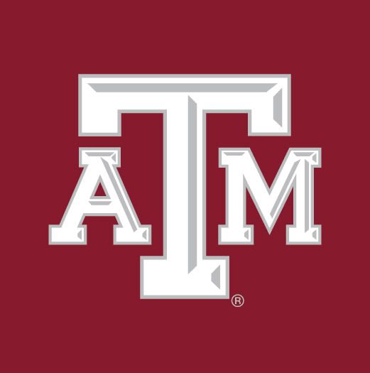
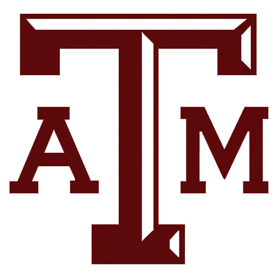
For you Bevel fanatics it looks like this is what the Bevel looked like originally, then they decided to eliminate the highlights from the "A" and the "M".


Show me on this doll where the bevel touched you.
I like it, but I doubt it looks good with more contrast (maroon bevel instead of gray)
I also doubt the "originality" of that logo since the letter proportions are the modern logo and not the smaller a & m from when the bevel first showed up.
We still doing this, huh?
http://boards.sportslogos.net/topic/49485-new-texas-am-logo-may-have-been-leaked
Above is a link to a thread about it from 2007.

[This message has been edited by Old Main (edited 5/7/2013 11:05p).]
Above is a link to a thread about it from 2007.

[This message has been edited by Old Main (edited 5/7/2013 11:05p).]
Dude get a life
From that same forum dedicated solely to sports logos you can find such gems as:
http://boards.sportslogos.net/topic/92558-please-help-me-get-rid-of-texas-ams-beveled-logo/
met with:
^ those are just from the front page
Seriously man, give it a rest. you are an embarrassment. You are actively trying to make Aggies look like a bunch of lunatics and even those who are passionate about logos on a forum specifically dedicated to sports logos think you are a joke.
Stop embarrassing the university you claim to care so much about.
[This message has been edited by Personal Best (edited 5/7/2013 11:46p).]
http://boards.sportslogos.net/topic/92558-please-help-me-get-rid-of-texas-ams-beveled-logo/
quote:
Please help me get rid of Texas A&M's beveled logo!
Started by Old Main, May 5/13 00:55
62 replies to this topic
#1 Old Main
Member
Members
9 posts
Joined: May 5/13
Posted May 5, 2013 - 00:55
I think this is a great website... I just discovered it yesterday. This is my very first post.
There are a bunch of Aggies trying to get rid of our stupid beveled logo. We have been complaining about it for years. Overall probably two-thirds of Aggies don't like the Bevel and it is our primary logo! I would appreciate any ideas, opinions, or advice. The NCAA has banned beveled numbers, so at least that will be gone. The Classic Block aTm logo is still on the helmet (and has been on the helmet since 1965). The Texas A&M Student Senate signed a Debevelization Representation Bill and is adding a vote on the Bevel to the Fall 2013 Student Body Elections.
met with:
quote:
The fight it with your administration and keep a sportslogo message board out of the discussion. Your 20 pages of word salad from you and Former Students does not need to be brought up here.
Will we also be asked to support not having the current student fees raised to assist Kyle Field or the Student Rec Center too?
quote:
This is a Texas A&M issue not an issue for those who like sports logos. If you all, as Former Students, do not really care, do not try to expand the losing fight since your "Old Main" student organization did not seem to last your graduate years according to the current student affairs list.
quote:
To be honest I read through the whole thing (for what reason I don't :censored:ing know...) and laughed at about half of it.
quote:
After (regrettably) glancing at the first sentence or two of your initial post, as a Mizzou fan and graphic artist, I say keep the bevel.
quote:
I know this is what we do at this place but....damn, man, you crossed the crazy line. Isn't one form letter response enough to tell you they aren't going to change it?
quote:
I read the whole thing and it is well reasoned but holy cow, I hope you one of your neighbors doesn't paint his house a color that isn't approved by your zoning rules!
quote:
as for the beveled logo, i see nothing wrong with it. Sometimes we got to embrace 'change'.
quote:
As long as the aTm has been around in bevel form, I think the younger fans have grown to identify with it better than the original.
^ those are just from the front page
Seriously man, give it a rest. you are an embarrassment. You are actively trying to make Aggies look like a bunch of lunatics and even those who are passionate about logos on a forum specifically dedicated to sports logos think you are a joke.
Stop embarrassing the university you claim to care so much about.
[This message has been edited by Personal Best (edited 5/7/2013 11:46p).]
Old Main getting his dick kicked in
quote:
Old Main getting his dick kicked in
Next thing you know, Old Main will have been the person who reminded Coach Dana X. Bible that E. King Gill was in the stands in the game against Centre College in 1922.
quote:
Personal Best
Not quite the reception Old Main was expecting on the sports logo forum, eh?
Personal Best wins.
EOT
Dear 8 pounds 6 ounces... new born infant jesus,don't even know a word yet. Please let this thread die
EOT
Dear 8 pounds 6 ounces... new born infant jesus,don't even know a word yet. Please let this thread die
Page Juan
What the bevel?
I hope this thread lives on just to piss you off
quote:quote:
Old Main getting his dick kicked in
Next thing you know, Old Main will have been the person who reminded Coach Dana X. Bible that E. King Gill was in the stands in the game against Centre College in 1922.
Not to mention that Fran had a newsletter
This thread will not die until the bevel dies. Our demand has been made.
Down with the bevel!!!!!!!!!
Featured Stories
See All
'Thank yOU?' A&M's outlook unaffected by disappointment at Auburn
by Olin Buchanan
27:51
8h ago
4.6k
12:07
7h ago
7.1k
Post Game Review: Auburn 43, No. 15 Texas A&M 41 (4OT)
by Kay Naegeli
1:54
22h ago
1.0k
Chace Sims locked in on playoff run while getting ready for Aggieland
by Ryan Brauninger


