
Canada's shirts are just a solid red and solid white t-shirt with a crest and a swoosh
* Official World Cup 2022 Thread *
201,142 Views |
2611 Replies |
Last: 6 mo ago by TRM
Adidas nailed their kits. Puma and Nike absolutely whiffed.
This is the saddest day in American soccer history and there was a day where we missed the World Cup because of a goal that didn’t go in the net and another day where our biggest star held up a Mexico scarf…
— Timmy Mieldezis (@TimmyMieldezis) September 15, 2022
Amazingly, looking at others, they could have been worse. That blue kit is awful though
Some magnanimous soccer-loving billionaire should buy up all of the new US shirts just to keep them off the street and out of the hands of impressionable youth.
— Jason Davis (@davisjsn) September 15, 2022
The kits, as bad as they are, are really just another entry in the long line of Nike using the NTs to promote Nike instead of actually trying to develop a consistent and recognizable look.
" According to Nike, the minimal design flourishes on the white jersey are supposed to evoke other popular American team sports. The company's logo is on each sleeve rather than the right breast, and so is intended to reflect American football jerseys. The centered U.S. Soccer crest is "akin to basketball jerseys," Nike said, while the shoulder and sleeve seams are supposed to resemble those found on hockey uniforms. The sleeve stripes "allude to classic striping detail found across American sport," Nike said, while the larger blue placket under the collar is part of a template used in several countries' kits, including the Netherlands, Australia, Nigeria and China. "
That's awful.
That's awful.
boogieman said:
" According to Nike, the minimal design flourishes on the white jersey are supposed to evoke other popular American team sports. The company's logo is on each sleeve rather than the right breast, and so is intended to reflect American football jerseys. The centered U.S. Soccer crest is "akin to basketball jerseys," Nike said, while the shoulder and sleeve seams are supposed to resemble those found on hockey uniforms. The sleeve stripes "allude to classic striping detail found across American sport," Nike said, while the larger blue placket under the collar is part of a template used in several countries' kits, including the Netherlands, Australia, Nigeria and China. "
That's awful.
Yep they're explanation actually makes them all the worse.
the hell does does that even mean. we piecemealed other sport common ideas into this one. sorry soccer fans you're getting leftoversboogieman said:
" According to Nike, the minimal design flourishes on the white jersey are supposed to evoke other popular American team sports. The company's logo is on each sleeve rather than the right breast, and so is intended to reflect American football jerseys. The centered U.S. Soccer crest is "akin to basketball jerseys," Nike said, while the shoulder and sleeve seams are supposed to resemble those found on hockey uniforms. The sleeve stripes "allude to classic striping detail found across American sport," Nike said, while the larger blue placket under the collar is part of a template used in several countries' kits, including the Netherlands, Australia, Nigeria and China. "
That's awful.

boogieman said:
" According to Nike, the minimal design flourishes on the white jersey are supposed to evoke other popular American team sports. The company's logo is on each sleeve rather than the right breast, and so is intended to reflect American football jerseys. The centered U.S. Soccer crest is "akin to basketball jerseys," Nike said, while the shoulder and sleeve seams are supposed to resemble those found on hockey uniforms. The sleeve stripes "allude to classic striping detail found across American sport," Nike said, while the larger blue placket under the collar is part of a template used in several countries' kits, including the Netherlands, Australia, Nigeria and China. "
That's awful.
Did they think they were going to trick people into thinking soccer is just like football or hockey or basketball?
Im convinced they let an intern design these and tried to explain it away with this bs. These are utter trash. Nike you suck.
KCup17 said:
Im convinced they let an intern design these and tried to explain it away with this bs. These are utter trash. Nike you suck.
No, this follows Nike's pretty typical MO - use the NT kits to promote a couple of their existing or upcoming templates splashed with (royal) blue and white. No attention paid to establishing a national brand or consistent identity. Just promoting Nike.
Right, but an intern could have actually colored in the design. It's like here is a template and hit it with some red white and blue however you see fit.
When does the Nike agreement end? I don't think Under Armour could do any worse
Ah, yeah, definitely. The template they used for the home whites is in their 2022 team catalog. The patterned look for the blue will be one of their new designs in 2023 if I had to bet.
akm91 said:
When does the Nike agreement end? I don't think Under Armour could do any worse
I don't know. I feel like if USSF would nut-up and tell Nike to put forth some effort or risk losing the contract, they would do it. Nike is capable of providing solid and consistent looks for other national teams, they just choose not to for the US.
So frustrating... Is what it is though.
Most of the adidas kits:
https://www.footyheadlines.com/2022/08/adidas-2022-world-cup-kits.html
Really dig Japan, Columbia, and *cough* Mexico.


https://www.footyheadlines.com/2022/08/adidas-2022-world-cup-kits.html
Really dig Japan, Columbia, and *cough* Mexico.
Yeah, adidas did pretty good this year. Puma, who is usually strong, mailed it in for some reason and went with templates.
boogieman said:
" According to Nike, the minimal design flourishes on the white jersey are supposed to evoke other popular American team sports. The company's logo is on each sleeve rather than the right breast, and so is intended to reflect American football jerseys. The centered U.S. Soccer crest is "akin to basketball jerseys," Nike said, while the shoulder and sleeve seams are supposed to resemble those found on hockey uniforms. The sleeve stripes "allude to classic striping detail found across American sport," Nike said, while the larger blue placket under the collar is part of a template used in several countries' kits, including the Netherlands, Australia, Nigeria and China. "
That's awful.
 ?_hv=2&w=900
 I'm sorry but these Canadian kits for the world cup are absolutely terrible, for the 2nd time Canada has ever qualified should be special, a plain red home and white away shirt is pure laziness @Drake @nike @welcomeOVO Nike x OVO kit would be the best kit #worldcup #canadasoccer pic.twitter.com/Qq6xAbHj95
— Taio (@GoonerTaio) September 15, 2022
Nike heard there was a football tournament coming up and got confused pic.twitter.com/xuLkkML6Bu
— American Hooligans🇺🇸⚽️ (@AmericanHoolis) September 15, 2022
Most of the WC kits Nike just dropped are mediocre at best.
Ken Scarborough said:boogieman said:
" According to Nike, the minimal design flourishes on the white jersey are supposed to evoke other popular American team sports. The company's logo is on each sleeve rather than the right breast, and so is intended to reflect American football jerseys. The centered U.S. Soccer crest is "akin to basketball jerseys," Nike said, while the shoulder and sleeve seams are supposed to resemble those found on hockey uniforms. The sleeve stripes "allude to classic striping detail found across American sport," Nike said, while the larger blue placket under the collar is part of a template used in several countries' kits, including the Netherlands, Australia, Nigeria and China. "
That's awful.
They just use MS paint to fill in the color.

Yep, I brought this up before but our kit IS psg's training kit.Ken Scarborough said:boogieman said:
" According to Nike, the minimal design flourishes on the white jersey are supposed to evoke other popular American team sports. The company's logo is on each sleeve rather than the right breast, and so is intended to reflect American football jerseys. The centered U.S. Soccer crest is "akin to basketball jerseys," Nike said, while the shoulder and sleeve seams are supposed to resemble those found on hockey uniforms. The sleeve stripes "allude to classic striping detail found across American sport," Nike said, while the larger blue placket under the collar is part of a template used in several countries' kits, including the Netherlands, Australia, Nigeria and China. "
That's awful.
So everything Nike said above is just PR bs, which we already knew.
Those uniforms are horrible. Wtf Nike.
Adidas really knocked it out of the park.
Adidas really knocked it out of the park.
It's maddening
I saw the USMNT kit leaks a while back and decided to design the proper set. Waldos at home, Stars on the road, and the special black & gold Declaration of Independence kit for the WC final. pic.twitter.com/faN3EAsnnB
— Chris Bunn (@ChrisBunn21) September 15, 2022
i had not seen this 3rd one before as an idea
These will be the first WC kits I will not buy any version of, hello darkness my old friend
All three of those are great.
How is it that Nigeria gets to have a semblance of consistency across their NT jerseys when it looks like Nike just pisses in the wind with ours every cycle?
If these USMNT uniforms were for the 2021 Gold Cup, it would be par for the course w Nike and the USMNT. But this is the World Cup. Does Nike not value this global marketing opportunity at all?
It's not that the uniforms are bad in and of themselves (again, par for the course on USMNT), it's that they seem to be the product of ZERO effort and originality. There's nothing there. It's a template, with roughly our national colors applied. I'm thoroughly confused. If Nike doesn't want to put effort into the USMNT, then why have they been out supplier for almost 30 years???
It's not that the uniforms are bad in and of themselves (again, par for the course on USMNT), it's that they seem to be the product of ZERO effort and originality. There's nothing there. It's a template, with roughly our national colors applied. I'm thoroughly confused. If Nike doesn't want to put effort into the USMNT, then why have they been out supplier for almost 30 years???
Our Gold Cup uniforms are always way better, IMO.
The last "new" jersey for a tournament before these is the special all red with stars and stripe hoop patterns that we wore in the 2019 gold cup, correct? The Red and Navy hoops with stars down the sleeves was also a Gold Cup jersey.
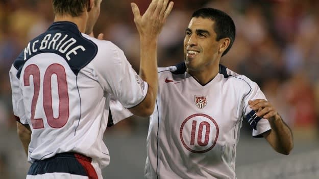
It's like McBride or someone at US Soccer said let's run back the 2004 Gold Cup unis
Featured Stories
See All
AggieNattie
FINAL from Blue Bell Park: Cal Poly 3, No. 1 Texas A&M 2 (Sunday)
in Billy Liucci's TexAgs Premium
54
EastTX_Aggie
FINAL from Blue Bell Park: Cal Poly 3, No. 1 Texas A&M 2 (Sunday)
in Billy Liucci's TexAgs Premium
48
Average Joe
Series Discussion: Aggies fail to sweep Cal Poly, drop Sunday finale
in Billy Liucci's TexAgs Premium
39