Texas A&M Football
Sponsored by

Four versions of the Texas A&M logo inside the state silhouette...

141,227 Views | 238 Replies | Last: 5 yr ago by monarch
Old Main
How long do you want to ignore this user?
AG
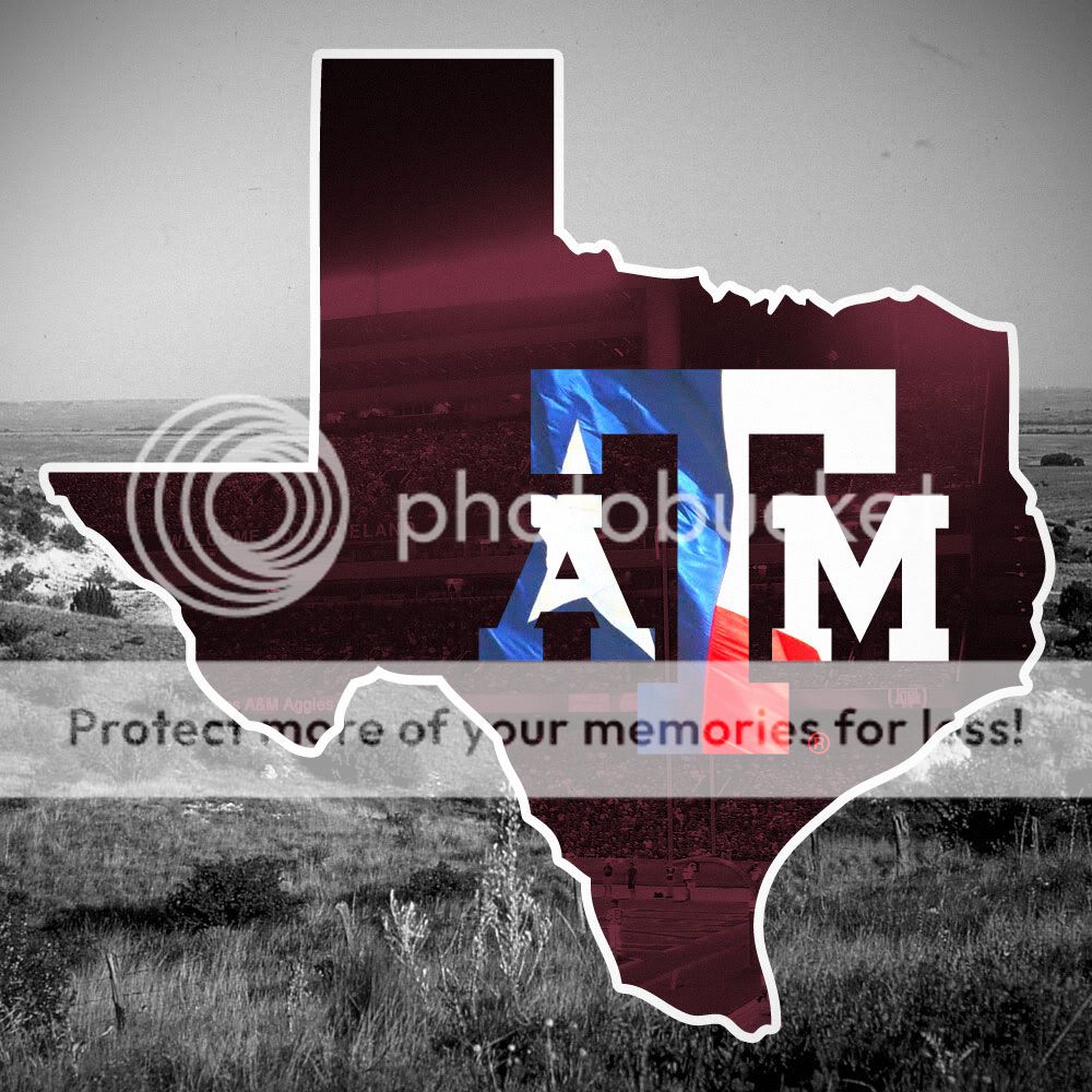
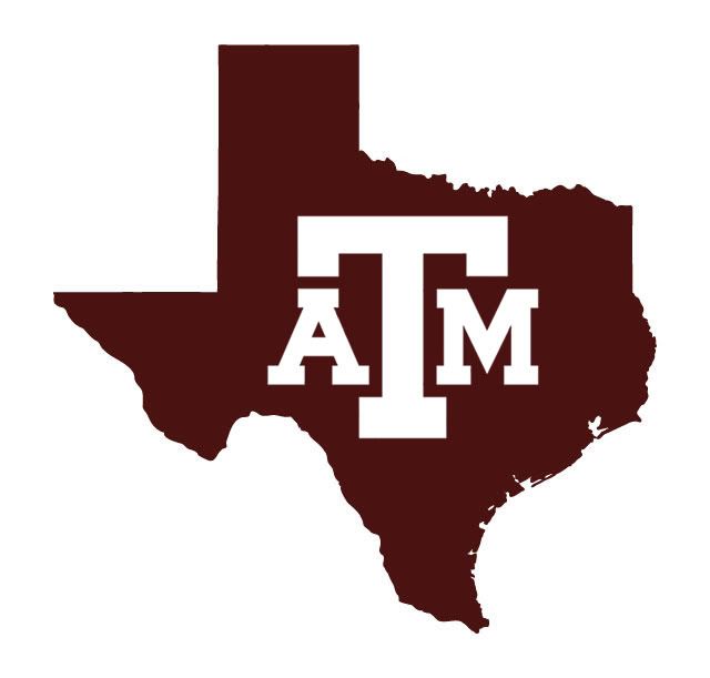
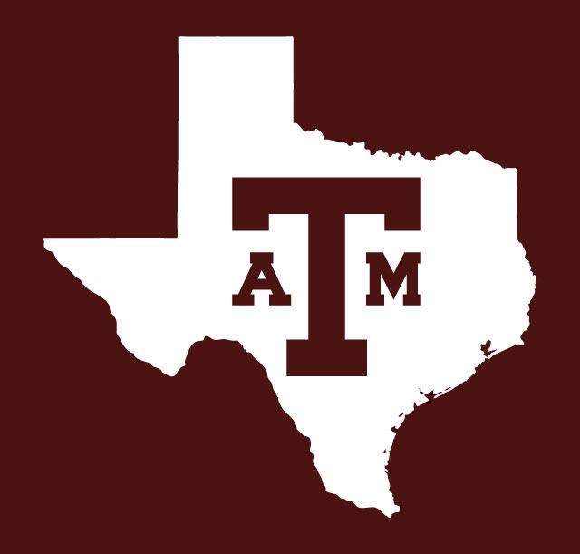
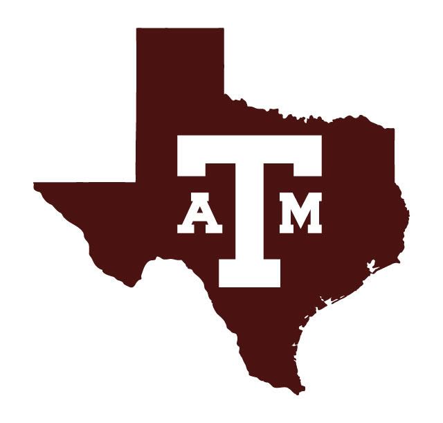
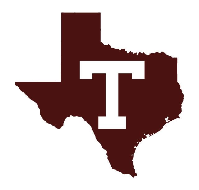
A lot of us have been talking about the need to claim the state of Texas in our marketing campaign since we will be the only Texas team in the SEC. There are many ways to do this. One way is to frame our simple, historic logos inside the state silhouette. This would be a secondary logo for the hip or shoulder/sleeve of the football uniform (for example), not the helmet.

One of my good A&M buddies professionally created these logos. If you like these feel free to use them any way you want to. If you think they are effective and know people in power who make decisions on our branding please pass them along.


Bear Bryant with Texas A&M "T" baseball cap


The baseball team has used this logo successfully...


Of course we need to start using TEXAS AGGIES more in our marketing...I don't know why we got away from that...I blame it on that damn beveled T!


[This message has been edited by Old Main (edited 9/6/2011 4:19p).]
SABUILDERAG
How long do you want to ignore this user?
Old Main: Can you make a window sticker out of one of the first two? If you can, PM or email me with a price.

Thanks.
AgLiftPilot
How long do you want to ignore this user?
AG
I bought a flag at one of the tent sales that has the maroon state version on it.
gigemags-99
How long do you want to ignore this user?
AG
I like number one. I'm actually feeling it on the maroon helmet. Don't mind the second one either, but it would have to go on a white helmet....yuck. don't think we should lose the A&M.

[This message has been edited by gigemags-99 (edited 9/6/2011 4:26p).]
MW03
How long do you want to ignore this user?
AG


[This message has been edited by MW03 (edited 9/6/2011 4:55p).]
Gone
How long do you want to ignore this user?
Sabreman
How long do you want to ignore this user?
AG
The only reason why I never bought a baseball jersey when I was a student at A&M is because they didn't sell the replicas with the state of Texas logo on the sleeve.

Sabreman '92


dmart90
How long do you want to ignore this user?
AG
The maroon Texas and white block ATM is the nuts.
chosin
How long do you want to ignore this user?
AG
We need to take Texas back. I don't get how we can have such bad marketing. Ideas like these are painfully simple and would do wonders to increase our brand.

[This message has been edited by chosin (edited 9/6/2011 4:29p).]
Killer-K 89
How long do you want to ignore this user?
AG
Old Main,

I like the maroon block T inside the white Texas.

What is your next venture now that it is imminent that we are heading to the SEC??

BTW- I gave away my last SECede bumper sticker this weekend to a good buddy who saw one and wanted one.

Thanks for all your work in this endeavor!!
Brewsky09
How long do you want to ignore this user?
AG
http://img854.imageshack.us/img854/2475/texasambackground.jpg

Here's one I made a couple years ago. Someone help me out with embedding the picture.

(Resized the first one)

[This message has been edited by Brewsky09 (edited 9/6/2011 4:39p).]
. . .
How long do you want to ignore this user?
BeardedBear
How long do you want to ignore this user?
AG


Old Main
How long do you want to ignore this user?
AG
Thanks KillerK89,

I'm still holding my breath until the SEC announcement is official. I know it is just a formality, but until it is official I am as nervous as a cat.

As you can see I've been trying to push our simple, historic logos. At the same time I want us to get away from the bevel T and some of this other crap we've been using to market ourselves.

I also want to try and get Texas A&M to claim 1917, 1919, 1927 and 1939 as our four national championships. I don't want to get into this now, but if you do some research you will realize there is absolutely no reason not to claim these. USC tries to claim our 1939 championship. When we win our first national championship as SEC members it should be #5 for us, not #2.

SABUILDERAG,

I'm not in the sticker/decal business. I made the aTm SECede stickers as a one time deal and gave them away for free. If you look online I think you will find people who will make these for you.

wee_ag
How long do you want to ignore this user?
AG
I vote one of these:


MW03
How long do you want to ignore this user?
AG


[This message has been edited by MW03 (edited 9/6/2011 4:54p).]
Brewsky09
How long do you want to ignore this user?
AG
http://img689.imageshack.us/img689/6663/texasamnobevel.jpg

No bevel
zag213004
How long do you want to ignore this user?
AG
the second pic.... like the baseball jerseys
texink
How long do you want to ignore this user?
AG
Did you resize the A and M? Doesn't look like our standardized logo. I love the white block T inside the maroon Texas though.
RedRider
How long do you want to ignore this user?
What about the t-star logo and the state, like on the Reed Arena basketball court?
GeronimoAg
How long do you want to ignore this user?
AG
I'm a big fan of the first two you posted with the Block ATM in the TX silhouette. I would really like to see it on the sleeves just like the baseball jerseys you posted.

Not too keen on the Block T alone for our uniforms. Our brand is the block ATM, I don't think many people outside of Aggieland and especially the state of Texas would know what the plain block T meant. Just my 2 cents.
BeardedBear
How long do you want to ignore this user?
AG


slow day at work.
Old Main
How long do you want to ignore this user?
AG
Nate09,

I made the A and M smaller like on my first SECede bumper sticker (below). I'm probably in the minority here, but I think it looks more balanced this way. If you look back at our history the A and M used to be small...there was more emphasis on the Block T. For some reason the A and M have gotten much bigger lately and I think it looks awkward. Again, just my opinion and I'm probably in the minority.


Red Rider,

I'm not sure what to think about the T-Star. I guess I just hate the bevel T (but I like the star part!). Texas Tech started the bevel TT and after that I didn't want us to do that. In addition there is a bevel highlight missing on the left inside "extension" of the top crossbar and that bugs me. I think it is OK as a secondary logo, but I think there are some people trying to make it our primary logo and I don't like that.


GeronimoAg,

With our new SEC branding and renewed national recognition anytime someone sees a maroon and white block "T" (especially inside the state of Texas silhouette) it should instantly be seen as a Texas A&M logo. In the 1950s the maroon and white block T stood for Texas A&M. If we like it we can add it to our logo arsenal.

Bear Bryant with the "T" baseball cap (mid-1950s)


[This message has been edited by Old Main (edited 9/6/2011 5:20p).]
tbirdspur2010
How long do you want to ignore this user?
AG
I know some of y'all will hate me for this, but the window decal I had on my old car when I was a fish was the state of Texas with the T-star logo in the middle. It was legit. Love to see more of that type of marketing!
tbirdspur2010
How long do you want to ignore this user?
AG
BeardedBear!
israeliag
How long do you want to ignore this user?
AG
I'm with you Old Main on the smaller A M. Besides more balanced it looks more classic.

Also, anyone able to help out a n00b and create a version of the T star on the state similar to Reed Arena?

http://farm4.static.flickr.com/3140/2297600442_8be57b2f49.jpg
Old Main
How long do you want to ignore this user?
AG
Here are some examples of the smaller A and M with more emphasis on the "T".

http://www.nationalchamps.net/Helmet_Project/


contemporary baseball cap


I guess for me when the A and M are smaller it looks more balanced and "tucked in" for lack of a better explanation.

When the A and M are real big these two letters extend beyond the "reach" of the T and it just looks unbalanced to me.


[This message has been edited by Old Main (edited 9/6/2011 6:07p).]
Old Main
How long do you want to ignore this user?
AG
wee_ag,

This logo is really sharp! I think it would look even better with a more collegiate font.


xottam
How long do you want to ignore this user?
dammit, you can't just do a 'T', that's for my Vols!!! you better include A&M in all logos, or I will tell our chancellor not to vote for A&M tonight!!!
E K Gill
How long do you want to ignore this user?
AG
I like the last one--solid maroon, with the T.
I'm not at all a fan of the small A and M used in the block aTm logos.
Texas Aggies is always a winner.
Nice job.

swampstander
How long do you want to ignore this user?
AG
RLM.Boise
How long do you want to ignore this user?
J_R might be on to something. I like!
Old Main
How long do you want to ignore this user?
AG
TexasAggies08 created one with the larger A and M (current logo).


Here is the smaller A and M for comparison.


[This message has been edited by Old Main (edited 9/6/2011 7:52p).]
. . .
How long do you want to ignore this user?
BillOnCapitolHill
How long do you want to ignore this user?


[This message has been edited by BillOnCapitolHill (edited 9/6/2011 8:22p).]
 
×
subscribe Verify your student status
See Subscription Benefits
Trial only available to users who have never subscribed or participated in a previous trial.