The classic aTm logo (the one on our helmets) looks better reduced to a small size than the bevel T aTm logo. As far as logos go simple is almost always better. I've seen some small bevel T logos on merchandise at Academy and Walmart and it looks like crap.
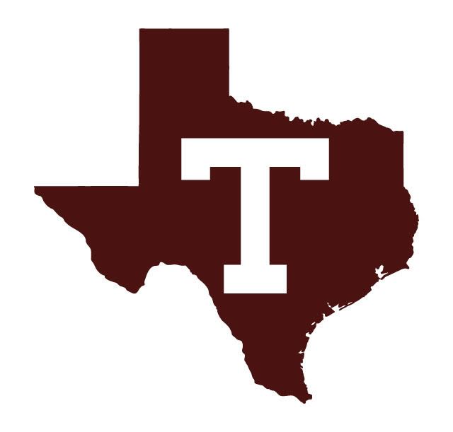
The small logo below looks fine in my opinion because the state of Texas silhouette is so recognizable.

Again, these ideas are proposed as secondary logos. I think the primary logo should be the classic aTm on our helmet. Right now our primary logo is the bevel T aTm logo.

[This message has been edited by Old Main (edited 12/21/2011 3:15p).]


 )
)