UPDATE:
http://www.printfection.com/TexianTees/SEC-ede-T-Shirt/_p_5644777
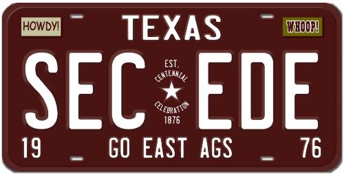
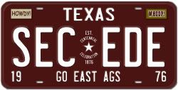
Sue94 contacted me about making t-shirts available on PrintPerfection and I thought it was a good idea. It is the license plate only design on an all white shirt. I already have one and it looks sharp. The t-shirt material has a good feel to it and is 100% cotton. Sue is setting these up to be sold at cost. You can also see this when you compare the costs of the other t-shirts.
Here is Sue's thread on the t-shirts:
http://texags.com/main/forum.reply.asp?topic_id=1797700&forum_id=5
Below is SECede bumper sticker #2. Everyone who sent me an email for the first one has four of these on the way. You should receive them Thursday or Friday. Anyone who wants four of these who didn't send me an email for the first one just send me an email at greg@marooned.biz with your mailing address. The sticker is free and there is no charge for shipping.
This bumper sticker is 4" x 11.7". The sticker was large enough that I had to order 6" x 12" envelopes which are not very common. If you want a smaller sticker you can cut out just the license plate portion of the sticker. The license plate portion of this sticker is about the same size as the first SECede sticker.
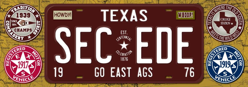
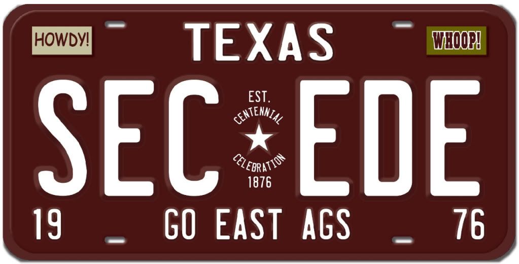
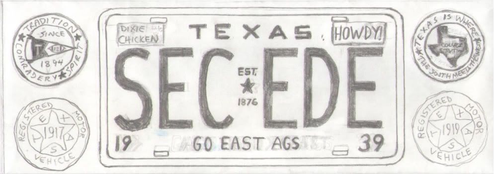
For those that are interested I'm going to give you some background on this sticker. The idea was to create a SECede bumper sticker that would be instantly recognized as promoting Texas A&M to the SEC without using any trademarks or licensed logos. My best idea was to create a license plate based on some old Texas plates. I wanted to use an old-style automotive and travel theme, so that is the style of the sticker.
The license plate I used is not based on any one plate. It is a combination of different features from a number of historic Texas plates. In 1925 and 1935 the plates were maroon so I used that.
http://www.worldlicenceplates.com/usa/US_TXXX.html
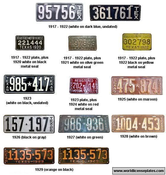
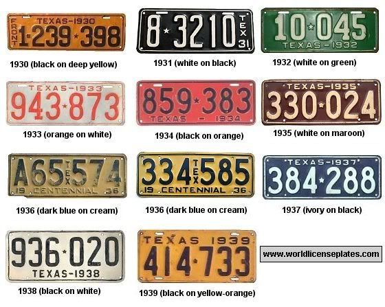
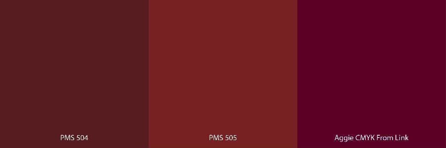
For the plate color I wanted to use a dark maroon color. The new official Aggie Maroon (the color on the right below the plate) looks too violet in my opinion, PMS 505 looks too red, so I used PMS 504 since it is the deep, dark maroon color that I think most Aggies tend to favor.

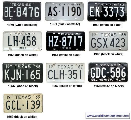
In the 1960s the letters and numbers were separated by a star and the characters were very basic. I especially like the 1964 and 1968 plates with the dark backgrounds so I incorporated some aspects of that design as well.
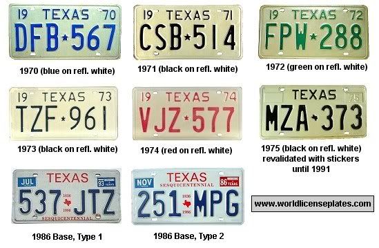
Starting in 1975 the plates had space for validation stickers so I used that for the placement of the HOWDY! and WHOOP! stickers.
I got the idea to use stickers to add character and familiarity to the plate from this California bumper sticker.
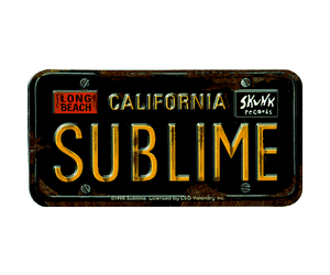
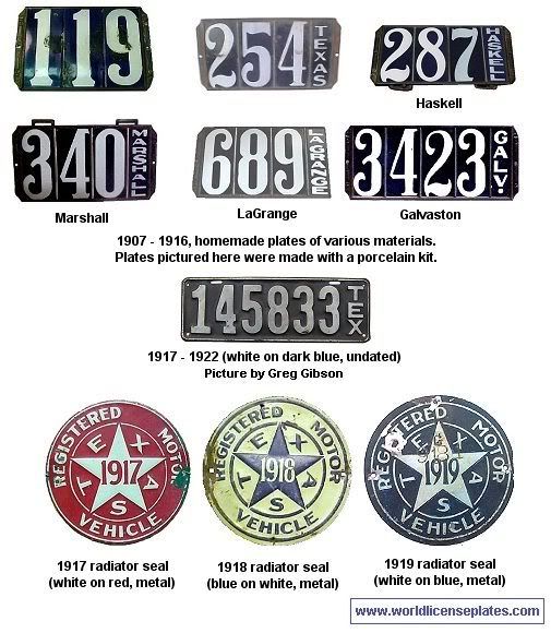
Originally I wanted to use HOWDY! on the right and a DIXIE CHICKEN sticker on the left, but the Chicken corporate office wouldn't give me permission to use their logo (back in the day Don Ganter would have given me permission in a minute). The khaki background of the HOWDY! sticker symbolizes the corps and the Army green background of the WHOOP! sticker symbolizes A&M's history of military service.
Since every Texas plate has a date I needed to settle on one year for the plate so I chose 1976. I chose 1976 for two reasons. One is that it represents the centennial for Texas A&M and centennials and sesquicentennials are always recognized on license plates (see the 1936 and 1986 plates). In addition, 1976 was a great year for Aggie football since we went 10-2, beat the horns, and then beat Florida in the Sun Bowl.
On some plates there is a saying or place that is recognized across the bottom (like the 1968 plate). After much deliberation I decided on "GO EAST AGS". At one point I was going to use "GEAUX EAST AGS", but I'm glad I decided against that.
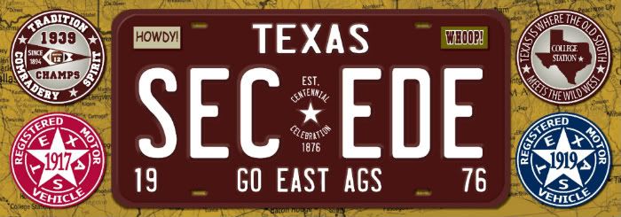
The four seals or tin signs continue the automotive theme. Three of the seals commemorate our 3 perfect seasons (no losses, no ties). All three should be considered National Championships, but that is a topic for another thread. The 1917 radiator seal was dark red so I used Alabama's official color (PMS 201). The 1919 radiator seal was dark blue so I used Auburn's official color (PMS 289). The fourth seal or sign is sort of like one of those old style tin travel promotion signs. I wanted to work in something about the south in there so I came up with that slogan.
For the background I used a road map that has College Station identified on the bottom left-hand corner as the western boundary and Florida and Georgia on the right side as the eastern boundary. You can see Baton Rouge across the bottom and other cities across the south. Across the top you can see the borders of Texas, Arkansas, Louisiana, Mississippi, Alabama, and Georgia. The bottom right-hand corner is the Florida panhandle. The map was tinted to make it look sort of like antique parchment.

The artist I worked with at the bumper sticker company (I used one in League City this time) was awesome. He took my basic drawing and I think did a great job in developing this bumper sticker. We went through 6 revisions to get to the final design. The actual sticker is glossy and looks even better than these images. I printed 2,000 of these. When the initial run is over maybe someone can order more from this company in League City.
Everyone I dealt with at the company was real excited about the sticker and went through extra effort to ship it to me USPS here in the Virgin Islands which saved me a bunch of money. They gave me the rights to all the artwork so if someone wants to print up t-shirts with the license plate portion of the sticker go ahead and do it. I think this would make a sharp t-shirt.

I thought it might be fun if people took photos of their car or truck with SECede stickers and posted it on this thread...especially if anyone was committed enough to put one on an expensive sports car! I would also like to see a photo of one on a really old truck from the 1940s or 1950s - That would just be cool. Of course, cool backgrounds like SEC stadiums, scenic overlooks, etc. would add interest as well.
Feel free to use either one of my sigs below if you want. I just upgraded to Photobucket Pro so I am unlimited as far as the amount of people who can copy and use the links below.
http://twitter.com/aTmSECede

[This message has been edited by Old Main (edited 2/25/2011 5:29p).]
http://www.printfection.com/TexianTees/SEC-ede-T-Shirt/_p_5644777
Sue94 contacted me about making t-shirts available on PrintPerfection and I thought it was a good idea. It is the license plate only design on an all white shirt. I already have one and it looks sharp. The t-shirt material has a good feel to it and is 100% cotton. Sue is setting these up to be sold at cost. You can also see this when you compare the costs of the other t-shirts.

Here is Sue's thread on the t-shirts:
http://texags.com/main/forum.reply.asp?topic_id=1797700&forum_id=5
Below is SECede bumper sticker #2. Everyone who sent me an email for the first one has four of these on the way. You should receive them Thursday or Friday. Anyone who wants four of these who didn't send me an email for the first one just send me an email at greg@marooned.biz with your mailing address. The sticker is free and there is no charge for shipping.
This bumper sticker is 4" x 11.7". The sticker was large enough that I had to order 6" x 12" envelopes which are not very common. If you want a smaller sticker you can cut out just the license plate portion of the sticker. The license plate portion of this sticker is about the same size as the first SECede sticker.


For those that are interested I'm going to give you some background on this sticker. The idea was to create a SECede bumper sticker that would be instantly recognized as promoting Texas A&M to the SEC without using any trademarks or licensed logos. My best idea was to create a license plate based on some old Texas plates. I wanted to use an old-style automotive and travel theme, so that is the style of the sticker.
The license plate I used is not based on any one plate. It is a combination of different features from a number of historic Texas plates. In 1925 and 1935 the plates were maroon so I used that.
http://www.worldlicenceplates.com/usa/US_TXXX.html


For the plate color I wanted to use a dark maroon color. The new official Aggie Maroon (the color on the right below the plate) looks too violet in my opinion, PMS 505 looks too red, so I used PMS 504 since it is the deep, dark maroon color that I think most Aggies tend to favor.


In the 1960s the letters and numbers were separated by a star and the characters were very basic. I especially like the 1964 and 1968 plates with the dark backgrounds so I incorporated some aspects of that design as well.

Starting in 1975 the plates had space for validation stickers so I used that for the placement of the HOWDY! and WHOOP! stickers.

I got the idea to use stickers to add character and familiarity to the plate from this California bumper sticker.

Originally I wanted to use HOWDY! on the right and a DIXIE CHICKEN sticker on the left, but the Chicken corporate office wouldn't give me permission to use their logo (back in the day Don Ganter would have given me permission in a minute). The khaki background of the HOWDY! sticker symbolizes the corps and the Army green background of the WHOOP! sticker symbolizes A&M's history of military service.
Since every Texas plate has a date I needed to settle on one year for the plate so I chose 1976. I chose 1976 for two reasons. One is that it represents the centennial for Texas A&M and centennials and sesquicentennials are always recognized on license plates (see the 1936 and 1986 plates). In addition, 1976 was a great year for Aggie football since we went 10-2, beat the horns, and then beat Florida in the Sun Bowl.
On some plates there is a saying or place that is recognized across the bottom (like the 1968 plate). After much deliberation I decided on "GO EAST AGS". At one point I was going to use "GEAUX EAST AGS", but I'm glad I decided against that.

The four seals or tin signs continue the automotive theme. Three of the seals commemorate our 3 perfect seasons (no losses, no ties). All three should be considered National Championships, but that is a topic for another thread. The 1917 radiator seal was dark red so I used Alabama's official color (PMS 201). The 1919 radiator seal was dark blue so I used Auburn's official color (PMS 289). The fourth seal or sign is sort of like one of those old style tin travel promotion signs. I wanted to work in something about the south in there so I came up with that slogan.

For the background I used a road map that has College Station identified on the bottom left-hand corner as the western boundary and Florida and Georgia on the right side as the eastern boundary. You can see Baton Rouge across the bottom and other cities across the south. Across the top you can see the borders of Texas, Arkansas, Louisiana, Mississippi, Alabama, and Georgia. The bottom right-hand corner is the Florida panhandle. The map was tinted to make it look sort of like antique parchment.

The artist I worked with at the bumper sticker company (I used one in League City this time) was awesome. He took my basic drawing and I think did a great job in developing this bumper sticker. We went through 6 revisions to get to the final design. The actual sticker is glossy and looks even better than these images. I printed 2,000 of these. When the initial run is over maybe someone can order more from this company in League City.

Everyone I dealt with at the company was real excited about the sticker and went through extra effort to ship it to me USPS here in the Virgin Islands which saved me a bunch of money. They gave me the rights to all the artwork so if someone wants to print up t-shirts with the license plate portion of the sticker go ahead and do it. I think this would make a sharp t-shirt.

I thought it might be fun if people took photos of their car or truck with SECede stickers and posted it on this thread...especially if anyone was committed enough to put one on an expensive sports car! I would also like to see a photo of one on a really old truck from the 1940s or 1950s - That would just be cool. Of course, cool backgrounds like SEC stadiums, scenic overlooks, etc. would add interest as well.
Feel free to use either one of my sigs below if you want. I just upgraded to Photobucket Pro so I am unlimited as far as the amount of people who can copy and use the links below.
http://twitter.com/aTmSECede


[This message has been edited by Old Main (edited 2/25/2011 5:29p).]


