Texas A&M Football
Sponsored by

Football Jersey Number Font

4,354 Views | 32 Replies | Last: 20 days ago by roughtuff98
roughtuff98
How long do you want to ignore this user?
Genuine question,

I am actually in favor of adidas, they match our color maroon well across the board, but why did the font for the numbers on our football jerseys change? The numbers are enlarged and get skinny at the top, and the font differs from the other Athletic team's jerseys.
https://aggieswire.usatoday.com/wp-content/uploads/sites/111/2022/10/USATSI_19328199-1.jpg?w=1000&h=600&crop=1

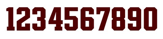
For example, our current men's basketball teams use the same number font as our 2016 era shoulder stipe uniforms:
https://th.bing.com/th/id/OIP.G_z5hdZt_M74akFOB9oGEwHaHa?w=173&h=180&c=7&r=0&o=5&dpr=1.3&pid=1.7
https://th.bing.com/th/id/OIP.Be94PEGkG6AojhEF3I_L3AHaIV?w=151&h=180&c=7&r=0&o=5&dpr=1.3&pid=1.7

I just wish we had more brand consistency with football man
4
How long do you want to ignore this user?
AG
I would like to see them done in calligraphy
TxAg76
How long do you want to ignore this user?
AG
Wingdings, or GTFO
Hank the Grifter
How long do you want to ignore this user?
StinkyPinky
How long do you want to ignore this user?
AG
It's less about font, but more about amount of bevel
roughtuff98
How long do you want to ignore this user?
StinkyPinky said:

It's less about font, but more about amount of bevel
Yeah I get that, I just think we have a tendency to lack brand consistency across our sports teams. Something is always changing, and I find it odd that our football numbers are different than every other sports team
TxAg76
How long do you want to ignore this user?
AG
roughtuff98 said:

StinkyPinky said:

It's less about font, but more about amount of bevel
Yeah I get that, I just think we have a tendency to lack brand consistency across our sports teams. Something is always changing, and I find it odd that our football numbers are different than every other sports team


Curious if some of the perceived distortion is jersey stretch from tight fit.
The font is still different.
But maybe not quite as bad as it seems due to some distortion playing into it too
VP at Pierce and Pierce
How long do you want to ignore this user?
The font is from the mid 2010s Chevy Tahoe dashboard. It looks terrible. I don't understand why the football numbers & letters cannot match the numbers of everyone else. The baseball and softball numbers are perfect. Use those.
JustisWalkert
How long do you want to ignore this user?
AG
Let's use Roman numerals because we don't like to be like other schools.
roughtuff98
How long do you want to ignore this user?
VP at Pierce and Pierce said:

The font is from the mid 2010s Chevy Tahoe dashboard. It looks terrible. I don't understand why the football numbers & letters cannot match the numbers of everyone else. The baseball and softball numbers are perfect. Use those.
My thoughts exactly.
Hub `93
How long do you want to ignore this user?
AG
Nothing wrong with block numerals, Adidas. Not everything has to be bespoke.
Aggie Dad 26
How long do you want to ignore this user?
cajunaggie08
How long do you want to ignore this user?
AG
Adidas, Nike, and Under Armour all like to create custom fonts that they own the rights to that way they are the only one that can legally create a jersey for sale that matches what is worn on the field. While traditional looks have now come back into fashion, the uniform companies dont want to use generic block numbers as other manufacturers have the rights to use that. The bigger question is why havent the football numbers found their way to the basketball jerseys.
92_Ag
How long do you want to ignore this user?
AG
VP at Pierce and Pierce
How long do you want to ignore this user?
cajunaggie08 said:

Adidas, Nike, and Under Armour all like to create custom fonts that they own the rights to that way they are the only one that can legally create a jersey for sale that matches what is worn on the field. While traditional looks have now come back into fashion, the uniform companies dont want to use generic block numbers as other manufacturers have the rights to use that. The bigger question is why havent the football numbers found their way to the basketball jerseys.


Interesting to know. Of course Adidas gave us the worst looking font of any college program. They also gave us to the worst looking striped pants from 07-09 too. Whoever oversees our account needs to put their foot down and say this looks bad, we will not be moving forward with this template.
TX_Aggie37
How long do you want to ignore this user?
AG
I think our football unis are great. Wouldn't change a thing if it was up to me.
The Zookeeper
How long do you want to ignore this user?
AG
TX_Aggie37 said:

I think our football unis are great. Wouldn't change a thing if it was up to me.
Bro, do you even TexAgs?
JJxvi
How long do you want to ignore this user?
AG
We have a numeral font that started being used everywhere in the athletic department. You see these on 12th man signage, and the same font face is also all of the capital lettering for things like the Home of the 12th Man signs and when you see things like A&M Athletics or A&M Basketball written out in like the capital block lettering.

These numerals were on our football jerseys prior to Jimbo taking the job and are on most of our other sports jerseys. It has some weird things happening, but mostly looks good. Some unifying features are lost without the versions that included the bevels, but I believe those kind of were legislated out of football (numbers with multiple colors)


The numerals currently used on the football jersey are an abomination that look like they took the numerals we were using before, brainstormed them into like 3 or 4 separate font faces, and then chose 0-9 from those 4 different sets of numbers willy nilly. 7's and 4's and 1's being the most egregious offenders.

Class of 65
How long do you want to ignore this user?
AG
Who gives a crap about font. Just play better
nu awlins ag
How long do you want to ignore this user?
AG
StinkyPinky said:

It's less about font, but more about amount of bevel
"I have a fever, and the only cure is I gotta have more BEVEL!"
Pizza
How long do you want to ignore this user?
TxAg76 said:

Wingdings, or GTFO


...webdings?
fightinag
How long do you want to ignore this user?
Class of 65 said:

Who gives a crap about font. Just play better
Aggie's do instead of focusing on performance !
NEXT YEAR IS HERE.......again
VP at Pierce and Pierce
How long do you want to ignore this user?
Class of 65 said:

Who gives a crap about font. Just play better


If we are going to always underperform I want to at least look good doing so. Underperforming and having a font that looks stupid while wearing the high school style Texas A&M across the jest is salt to a big wound.
yell_on_6th st
How long do you want to ignore this user?
AG
Sgt. Schultz
How long do you want to ignore this user?
AG
Just do a version of this and call it a day


I know NOTHING!!!!
GrapevineAg
How long do you want to ignore this user?
AG
The numbers look good on our basketball, baseball, and softball jerseys - why can't football follow that standard?
Quad Dog
How long do you want to ignore this user?
AG
Our football uniforms have special numbers with a "barbwire accent"
VP at Pierce and Pierce
How long do you want to ignore this user?
Just terrible. They look like someone free hand traced them on the jersey while being the passenger on a road trip.
greg.w.h
How long do you want to ignore this user?
AG
92_Ag said:


Ewwwโ€ฆ
rcb05
How long do you want to ignore this user?
AG
Adidas gave our football team a proprietary number font when we got the uniform redesign in 2020, and I agree that it isn't all that great. There are certainly worse ones out there, but I wouldn't preferred that we stuck with the number font used across the rest of our athletic department.
nu awlins ag
How long do you want to ignore this user?
AG
Quad Dog said:

Our football uniforms have special numbers with a "barbwire accent"

Best maroon match I've seen.
VP at Pierce and Pierce
How long do you want to ignore this user?
I have yet to see a worse font but maybe there is one out there.
roughtuff98
How long do you want to ignore this user?
JJxvi said:

We have a numeral font that started being used everywhere in the athletic department. You see these on 12th man signage, and the same font face is also all of the capital lettering for things like the Home of the 12th Man signs and when you see things like A&M Athletics or A&M Basketball written out in like the capital block lettering.

These numerals were on our football jerseys prior to Jimbo taking the job and are on most of our other sports jerseys. It has some weird things happening, but mostly looks good. Some unifying features are lost without the versions that included the bevels, but I believe those kind of were legislated out of football (numbers with multiple colors)


The numerals currently used on the football jersey are an abomination that look like they took the numerals we were using before, brainstormed them into like 3 or 4 separate font faces, and then chose 0-9 from those 4 different sets of numbers willy nilly. 7's and 4's and 1's being the most egregious offenders.


Well said.
The numbers are just embarrassing. I'd love to buy a football jersey, but i cant bring myself to do it when our 4's and 7's look like they belong on a little league football jersey
Refresh
Page 1 of 1
 
×
subscribe Verify your student status
See Subscription Benefits
Trial only available to users who have never subscribed or participated in a previous trial.