

Top of page 2
Let's talk about the bevel
20,111 Views |
104 Replies |
Last: 5 yr ago by RAB83

Dumbass
noted
Here is a link to a camera frame that you can use for your camera or Facebook profile pics. It is not beveled.
www.facebook.com/fbcameraeffects/tryit/457860094723458/
www.facebook.com/fbcameraeffects/tryit/457860094723458/
In addition to the bevel, the other branding thing that is trash, is how they show the logo. Why in the hell do we put a white logo on a giant maroon square. Why isn't it just the stand alone aTm? If the background is white, put a maroon logo, if the background is dark, put a white logo. Here is a perfect example, College Football Teams, all of the other teams just have a free standing logo, all of them except ours. It should just be a solid maroon aTm, instead, we create a false maroon background for a white logo to sit on...complete idiocy and it looks like trash. It's even worse on television broadcasts when the logo are floating in the background and the big giant maroon square goes floating by. Seriously looks like a 2nd grader designed it.
Maybe because the official color of the aTm is white? I dunno if that's true but it would be plausible.
I don't mind having a bevel, but the one we have now is trash and doesn't make geometric sense.
Quote:
Maybe because the official color of the aTm is white? I dunno if that's true but it would be plausible.
The football team has worn the maroon aTm on white helmets before... I believe that either way is acceptable for the official logo.


Old Main said:Quote:
Maybe because the official color of the aTm is white? I dunno if that's true but it would be plausible.
The football team has worn the maroon aTm on white helmets before... I believe that either way is acceptable for the official logo.
YES!! Now this thread means something! OM has chimed in!!
Let’s Go Brandon!
the bevel is like bush....it was good in the 70's
I live in waco....therefore, I am ready to move elsewhere.


Elections are when people find out what politicians stand for, and politicians find out what people will fall for.
- Alfred E. Neuman
- Alfred E. Neuman
The correct bevel is even worse and I would have thought that was impossible.rocky the dog said:
Then we shouldn't bevel at all.Quote:
The correct bevel is even worse and I would have thought that was impossible.
Elections are when people find out what politicians stand for, and politicians find out what people will fall for.
- Alfred E. Neuman
- Alfred E. Neuman
To expand on what Rocky was pointing out...


I heard the biggest fear was that a fox might eat the bevel.
GSPag` said:
I heard the biggest fear was that a fox might eat the bevel.

What if we did raised lettering so the 3d effect was natural and instead of white we used "Bone".rocky the dog said:Then we shouldn't bevel at all.Quote:
The correct bevel is even worse and I would have thought that was impossible.
azulAg said:
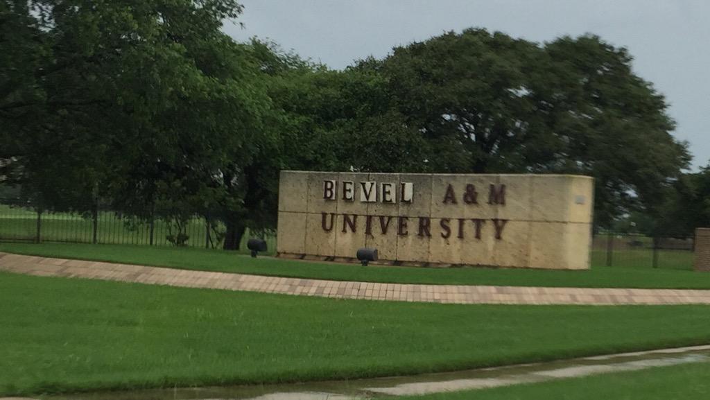
Texags when they first saw the bevel!
My gosh, that's awful. Like replacing the ivy at Wrigley Field with orange plastic flowers and mardi gras beads.Old Main said:
A friend of mine alerted me about this thread. Most of my thoughts are contained in the bevel letter at
http://nobevel.com
The worst part about the bevel is that it was incorporated into our University seal. The students begged President Young not to use the beveled seal on their diplomas, so the diplomas still use the traditional seal unless that has changed recently.

I would buy any of the trapezoidal or triangular examples shown...as long as they are superimposed over a Texas state outline.Old Main said:
To expand on what Rocky was pointing out...
1. Our school colors are Maroon and White.Quote:
What if we did raised lettering so the 3d effect was natural and instead of white we used "Bone".
2. If the bevel is incorrect, color change won't correct it.
3. Maybe this will help...

Elections are when people find out what politicians stand for, and politicians find out what people will fall for.
- Alfred E. Neuman
- Alfred E. Neuman
The bevel has and always will suck ass.
End of discussion.
End of discussion.
I hate the bevel too. It's not as bad to me when it's a white aTm with a grey bevel. That blends better than with a maroon bevel
I can't believe Bryce prefers van pattens card to mine
Ha! Exactly. Don't get me started on Paul Allen that guy is a total ahole.
Sorry, I was kind of trolling here. I was shooting for mildly amusing not undermining the fabric of our branding. I hate the bevel. The irony is that someone in marketing is looking at that incredibly detailed diagram posted and probably saying we should just leave the bevel and update it to make it look like one of the one from the texags post.
Quote:
I hate the bevel too. It's not as bad to me when it's a white aTm with a grey bevel. That blends better than with a maroon bevel
A white "T" with white bevels looks even better than a white "T" with gray bevels...
All kidding aside, obviously the reason that the white "T" with gray bevels looks better than maroon bevels is because the gray looks more like an actual shadow. A white "T" would never cast a maroon shadow unless maybe it was the result of some type of bizarre lighting effect. The gray bevels against white also minimizes the visual impact of all the mistake in the logo.
Geometry is math. The geometry of the beveled logo is incorrect. It is unbelievable to me that a University awarding degrees in engineering, architecture, computer visualization, construction science, and other programs utilizing mathematics would have a logo that is mathematically incorrect... it is embarrassing at best.


Talk it to death then lean over and whisper in its ear!!!! The dead horse is DEAD!!!!!azulAg said:
We all know it sucks, but why is the logo on the helmet not beveled but the one on the field is ? Why are the numbers beveled but the lettering not ? Also why is the logo on the back of the Jumbotron not beveled. It's these inconsistencies that keep me up at night . Either bevel everything or don't
yall are hilarious you know that
there have been several times I wanted to buy an Aggie shirt or hat, but the bevel looked so bad that I just couldn't do it. If it's a grey bevel on white aTm I'm ok with it.
But at the end of the day, the logo with no bevel looks best!
Is there anyone that actually prefers the bevel to no bevel?
it's got to be a very small percentage
I know there are some people that are indifferent to it, but I don't think anyone prefers it.
Maybe I'm wrong?
But at the end of the day, the logo with no bevel looks best!
Is there anyone that actually prefers the bevel to no bevel?
it's got to be a very small percentage
I know there are some people that are indifferent to it, but I don't think anyone prefers it.
Maybe I'm wrong?
Have you seen the hat where the A&M is in highly raised letters with the faux beveling. Lovely. The only thing worse would be leopard print A&M. Just kidding, not giving ideas A&M brading folks.JaySugar said:
there have been several times I wanted to buy an Aggie shirt or hat, but the bevel looked so bad that I just couldn't do it. If it's a grey bevel on white aTm I'm ok with it.
But at the end of the day, the logo with no bevel looks best!
Is there anyone that actually prefers the bevel to no bevel?
it's got to be a very small percentage
I know there are some people that are indifferent to it, but I don't think anyone prefers it.
Maybe I'm wrong?
OM, will you post the evolution of a logo post here. I think that's way more damning than the correct bevel argument. Some newer Texagers may not have seen that info yet.
Why is only the T in a 3-dimensional space?
To trigger engineers
Florida Aggie
Texas A&M Offers Iowa WR Jacob Bostick (Transfer Portal)
in Billy Liucci's TexAgs Premium
110
Spaceship
Texas A&M Offers Iowa WR Jacob Bostick (Transfer Portal)
in Billy Liucci's TexAgs Premium
103
Bullpen Chias
Buy the sip season ticket holder offers. A&M/tu Football Game
in Billy Liucci's TexAgs Premium
61