

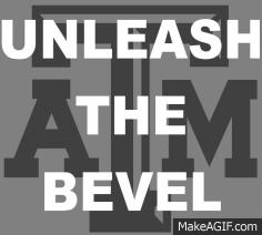
We all know it sucks, but why is the logo on the helmet not beveled but the one on the field is ? Why are the numbers beveled but the lettering not ? Also why is the logo on the back of the Jumbotron not beveled. It's these inconsistencies that keep me up at night . Either bevel everything or don't
Let's talk about the bevel
20,065 Views |
104 Replies |
Last: 5 yr ago by RAB83
Here, have a blue star. Feel better now?
I've never figured out what the bevel is actually showing. I'm no artist but it appears artistically incorrect to me.
NARRATOR: But no blue star was to be given that day.lda6339 said:
Here, have a blue star. Feel better now?
The bevel went to Waco.
No, please don't.azulAg said:
Either bevel everything

This thread means nothing unless Old Main comments!
Let’s Go Brandon!
The bevel went down to Georgia...FriscoKid said:
The bevel went to Waco.

Get rid of the damn bevel. Looks cheap and trashy. Use the throwbacks, take
away the hole in the numbers tear away jersey look, straight white Texas A&M and numbers and put a stripe down the pants like the old ones.
away the hole in the numbers tear away jersey look, straight white Texas A&M and numbers and put a stripe down the pants like the old ones.
no i dont, i hate the bevel
Need to bevel his eyebrows.
If that is what keeps you up at night, you're living a good life.
I like the bevel.
According to the Biden White House, what Joe Biden says does not represent the official position of the Biden administration.

...in Morgan Freeman's voice.Moe 92 said:NARRATOR: But no blue star was to be given that day.lda6339 said:
Here, have a blue star. Feel better now?
The bevel is like a tarp. You bring it out to hide something...
Honestly: it's a drop shadow incorporated within the mark in an attempt to keep it slick and trim. The mark is used to distinguish the flagship university of the system from the other schools in the system.
The branding is rather obvious though the bevel itself has to be explained in order to "get it." I also suspect it was done to distinguish from the block serif font by itself to make the trademark more registrateable and defendable especially against vendors.
I don't care for the inversion of the drop into the mark as a shadow of a non-existent emboss. But they didn't consult me either. I'll note in many cases our branding feels like something Aggies would do...but Cook is the one who drove the branding though it's not possible to know for sure exactly how the mark evolved. I heard a design student did it.
Old Main incoming in 3...2..1..
The bevel is busy trash.
I honestly don't care one way or the other I just like the way people get worked up over insignificant stuff like a bevel.
According to the Biden White House, what Joe Biden says does not represent the official position of the Biden administration.
As you can tell from my comment, I really don't care either. I worked as a producer at Microprose Austin (the old Simtex started by Aggies) and had a team of artists that were incredibly talented carefully coaching me on my comments on art. I learned to let the lead artists cover my concerns with me in private and convey appropriate guidance to the working artists rather than me talking to them.
I also learned to hear explanations of intentions with stylized art and interpret how that matched the art direction. But I still get uncomfortable when something feels "weird" in what could be an uncanny valley sense. The styling on the bevel very much strike me that way largely for specific reasons Old Main has cited.
Interestingly enough, another source of that weirdness was on a moving map display that used an FPGA to provide highlights on the map based on a northwest light source and that could not be changed. imagine the sun always shining from a 60 degree oblique angle just to picture the confusion across the world as opposed to a single light source casting shadows more naturally at different angles.
Jason really elevated the marketing for A&M except for our logo. Switching logos was a really bad decision and tarnished his tenure in my mind. I worked with most of the people at the ad agency that he used and they either went to tu or were sip lovers. I believe the new logo was designed by Nike, but I'd like to know who he consulted with and why he decided to make this our primary logo. I understand there are people who do not understand design or make bad design choices, but this was his job. I still cannot stand the new logo and I personally buy a lot of '47 brand clothing.
A properly done bevel would be fine. The problem is that it was not done correctly IMO.

yep, you can tell it is off season
A friend of mine alerted me about this thread. Most of my thoughts are contained in the bevel letter at
http://nobevel.com
The worst part about the bevel is that it was incorporated into our University seal. The students begged President Young not to use the beveled seal on their diplomas, so the diplomas still use the traditional seal unless that has changed recently.

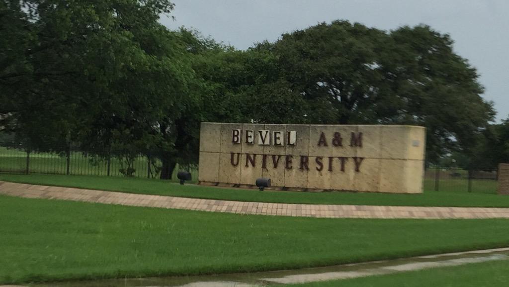
Article about the students changing the front entrance sign to BEVEL A&M UNIVERSITY
http://nobevel.com
The worst part about the bevel is that it was incorporated into our University seal. The students begged President Young not to use the beveled seal on their diplomas, so the diplomas still use the traditional seal unless that has changed recently.
Article about the students changing the front entrance sign to BEVEL A&M UNIVERSITY
It's just extraneous visual noise that causes the logos to be more difficult to distinguish at a distance. They did it for additional trademarking I am sure.
Old Main said:
A friend of mine alerted me about this thread. Most of my thoughts are contained in the bevel letter at
http://nobevel.com
The worst part about the bevel is that it was incorporated into our University seal. The students begged President Young not to use the beveled seal on their diplomas, so the diplomas still use the traditional seal unless that has changed recently.
The new seal is a travesty indeed. It went from stately to campy.
chevy con queso said:Old Main said:
A friend of mine alerted me about this thread. Most of my thoughts are contained in the bevel letter at
http://nobevel.com
The worst part about the bevel is that it was incorporated into our University seal. The students begged President Young not to use the beveled seal on their diplomas, so the diplomas still use the traditional seal unless that has changed recently.
The new seal is a travesty indeed. It went from stately to campy.
It seems like such a no brainer to get rid of the bevel and the new seal. I know they started converting a lot of things based on these changes, but there are still a lot of things with the old logos (and new things still being made with the unbevelled block aTm).
The part that bothers me the most is that the beveled crap Texas A&M has today is a cheap copy of Texas Tech's logo. In 1997, Tech asked Nike to update their double T logo. The beveled double T was born. Texas Tech still uses that logo. Nike also provided A&M's uniforms. So in 1998 NIke showed up with the stupid "T-star" & the "Beveled" T. Some idiot in the marketing arm of Texas A&M though it would be a good idea to use these logos as a secondary logo. Thankfully the T-star went away. It is time to get rid of the "Beveled" crap as well. Texas A&M should not copy Tech in anything.
Aggie Band not the easiest but the Best.
more reason why nike is a **** company just like ford and patagonia
The bevel is a blight on our good name and logo. Let us unite against the bevel. End bevelism now. Do it for the children!
The bevel is awful. Looks like a streak from a dirty printer.
The bevel is another good metric for being a waste of space.
rca21978
ATM Softball - the lady dancing in the stands and the backstory
in Billy Liucci's TexAgs Premium
14