Texas A&M Football
Sponsored by

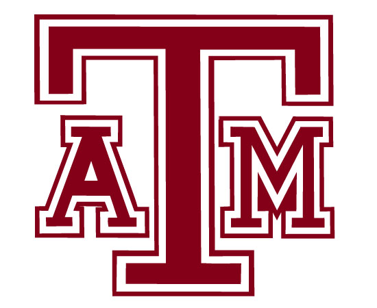
The History of the ATM Logo

22,220 Views | 51 Replies | Last: 10 yr ago by Brazos Ag 1970
RealMcCoy09
How long do you want to ignore this user?
AG
This is not a bevel/non-bevel thread, I am simply interested to know if if we have a more detailed history of the ATM logo than the one I can find on
http://www.sportslogos.net/logos/list_by_team/866/Texas_AM_Aggies/

I know that the current block ATM is missing, as well as the mid-70/80's ATM with the Maroon T and White A&M. I find it interesting that there is so much history in the school logo, but not many places to find what was used and in what era.

Football related because our logo is used on our Uniforms and we change those every 3 years now. Discuss.

sleepybeagle
How long do you want to ignore this user?
AG
Yes... but it will become on in a post or two.
Bed Sores
How long do you want to ignore this user?
72-80
DifferenceMaker Ag
How long do you want to ignore this user?
Pretty sure I know what our next logo will be.

HowdyAgs03
How long do you want to ignore this user?
AG
Non-Bevel
Personal Best
How long do you want to ignore this user?
AG
Didn't read but. Bevel
RealMcCoy09
How long do you want to ignore this user?
AG


Consistency has never been our forte


[This message has been edited by RealMcCoy09 (edited 4/16/2014 11:09p).]
redd38
How long do you want to ignore this user?
AG
I don't know if I would call us being sloppy with our logo "so much history"
$3 Sack of Groceries
How long do you want to ignore this user?
AG


Needs to be a bit of a darker maroon, but we never should have abandoned this logo. Best we've ever had.
clintalmighty
How long do you want to ignore this user?
AG
quote:


Needs to be a bit of a darker maroon, but we never should have abandoned this logo. Best we've ever had.


said no one ever
InnerCityAg
How long do you want to ignore this user?
Bevel
Removed:15444557
How long do you want to ignore this user?
quote:

Ringo88
How long do you want to ignore this user?
AG
I'll say it, Clint.
I agree with Beer Leg 100%. That's the best logo version we've ever had. It's on the west side of Kyle Field, the water tower, and is (was?) on all the street signs on campus.
GrapevineAg
How long do you want to ignore this user?
AG
Can't find just the logo, but here's another one:

aggiespartan
How long do you want to ignore this user?
AG
Awesome. I'm making some cookies for our Muster auction and this gave me a few more ideas.
stetson
How long do you want to ignore this user?
AG
Our logo blows. Always has and always will until we come up with something better than letters.
clintalmighty
How long do you want to ignore this user?
AG
quote:
Our logo blows. Always has and always will until we come up with something better than letters.

lol wut
BryanAggie2013
How long do you want to ignore this user?
AG
We've had some legit logos. Wish there was more stuff out there with some of those old school ones on it.
Builder93
How long do you want to ignore this user?
AG
quote:
Always has and always will until we come up with something better than letters.


Maybe we could use numbers or hieroglyphics instead.
stetson
How long do you want to ignore this user?
AG
Or maybe a symbol. Missouri wisely made the change as have other schools. It's not the 1950's and 60's anymore.

[This message has been edited by stetson (edited 4/17/2014 11:08a).]
BryanAggie2013
How long do you want to ignore this user?
AG
The difference is, in Missouri's case, the M is a logo for them, and Michigan, and Minnesota, and Maryland and Memphis....

What else is aTm going to stand for really? I don't have any problem with us sticking with our letters and not going to symbol.. Even if we did, what would you suggest going with? I love Ol' Sarge but I don't think that would be our best move to make a primary logo.
Builder93
How long do you want to ignore this user?
AG
You also have to look at brand recognition. Why change the logo now that it has been on ESPN 30 times a day for the past year? "Hey, now that you know who we are, we're going to go incognito and play hide and go seek."
$3 Sack of Groceries
How long do you want to ignore this user?
AG
There's nothing the logo can change to that will be nearly as recognizable or effective. We're the Aggies. It's not like we're the Armadillos and could draw a "fiercer" image. We're pretty limited.

P.S. I don't mind the ATM logo at all, I just wish we'd stick with ONE (preferably the one I posted earlier) and demand consistency.
light em up
How long do you want to ignore this user?
Simply the number 12 could be an option to look at
InnerCityAg
How long do you want to ignore this user?
quote:
Our logo blows. Always has and always will until we come up with something better than letters.


I suggest an Ocypode:

jpc08
How long do you want to ignore this user?
AG
quote:
Simply the number 12 could be an option to look at

I don't think that would be allowed on jersey/uniforms. It would get mixed up with the player's numbers.
DifferenceMaker Ag
How long do you want to ignore this user?
quote:
quote:
Our logo blows. Always has and always will until we come up with something better than letters.


I suggest an Ocypode:


Mantis shrimp or GTFO!


NE PA Ag
How long do you want to ignore this user?
About the only thing I can come up with is an angry farmer (maybe this one is a bit too Amish looking):


[This message has been edited by NY Ag (edited 4/17/2014 12:32p).]
jpc08
How long do you want to ignore this user?
AG
DifferenceMaker Ag
How long do you want to ignore this user?
Here are a few serious alternatives:


Get busy Jason Cook!!
peace
How long do you want to ignore this user?
S
just drop the bevel and all is well. The one on the football helmets is all that is needed anywhere. Consistency, no t-star, or outlines needed. Simplicity is best!! A university that prides itself on so much tradition, should just stop trying the latest in graphics.
Where or who exactly, is responsible for the bevel distraction?
stetson
How long do you want to ignore this user?
AG
The university crest and Aggie ring crest are a start and are at least symbols rather than a grouping of three block letters (yawn). Corps Stack is better as well.
Capt. Augustus McCrae
How long do you want to ignore this user?
AG
This was the best one:

Aggie Infantry
How long do you want to ignore this user?
AG
I have always been a fan of:
FiTxAg04
How long do you want to ignore this user?
AG
That old AMC logo from 1908-1927 is the exact image that I scanned from the back of the Maroon Out shirt way back in like 2005 to use on my old Rivals sig. That's the reason why it looks all spotted and weird when you look at the large version, because it's scanned from a t-shirt.
Page 1 of 2
 
×
subscribe Verify your student status
See Subscription Benefits
Trial only available to users who have never subscribed or participated in a previous trial.