Texas A&M Football
Sponsored by

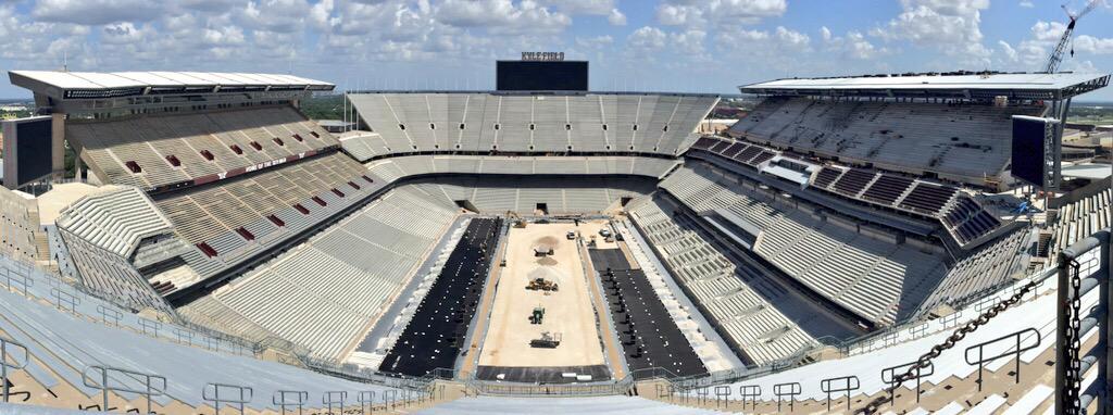
The new Kyle Field- weekly pictures

2,173,528 Views | 5140 Replies | Last: 7 yr ago by Definitely Not A Cop
St Hedwig Aggie
How long do you want to ignore this user?
AG
quote:
quote:
I give the new kyle a 7/10. Would have been a 9/10 had they started from scratch. But a 7 ain't bad and is a lot better than the 3/10 we had.


Completely agree. It's never going to be on a "top 10 coolest looking stadiums" list, but it is a significant improvement for us.


BAS has subtle ways of manifesting itself sometimes...I have never, ever seen or read a top 10 "coolest looking stadia" and I'm guessing you never had either...so don't worry about it! Other than architects and a few drama queens, no one cares about a stadiums empty look...when filled is when a stadium's true character emerges...you'll
Be LONG dead when the next big thing happens at Kyle so best not to think about it...
class12of
How long do you want to ignore this user?
AG
According to MUCH of the misinformed media it is usually "aggieville" or "aggie nation" anyway....
Citizen Reign
How long do you want to ignore this user?
quote:
According to MUCH of the misinformed media it is usually "aggieville" or "aggie nation" anyway....


Misinformed maybe...or they understand they call it what ever they want.
Agnzona
How long do you want to ignore this user?
quote:
quote:

What's going on here?

I assume it's related to drainage, but....specifically?


That's where the slot receiver lines up.

Does the field have a vibration motor to help the players move?
torrid
How long do you want to ignore this user?
AG
So they are putting down what looks like a giant moisture barrier across the entire field. I guess this will ensure that all the water gets to the Freedom drains and prevents a repeat of the Rice game last year. I suspect there will be a layer of dirt over that, THEN we'll start getting our grass.

Oh, someone needs to clean the bird crap off the west side exterior cam.
jmfshr
How long do you want to ignore this user?
AG
What are those box-looking objects, on the top of the SEZ, up against the fence?... Speakers?
rcb05
How long do you want to ignore this user?
AG

The Collective
How long do you want to ignore this user?
AG
I don't care what some might say - that place is badass.
rcb05
How long do you want to ignore this user?
AG
It's just too bad that we have the only football stadium in pro sports with seating areas that are asymmetrical and don't match up perfectly.


chipotle
How long do you want to ignore this user?
The term "symmetry" gets thrown around here too much. I think the term we want to use is "balance". There are plenty of stadium examples that have this balance but our not symmetrical. Since kyle field is designed mostly out of functional requirements and budget restrictions there are a lot of prominent elements that are lacking balance:

-back of SEZ
-integration of east side
-Godzillatron wars*
-corner transitions

*really feel we should have had 4 large corner screens and put a stop to the "having the biggest screen" diq contest
spanky
How long do you want to ignore this user?
AG
quote:
-integration of east side

I thought they did a nice job with the east side. Integrates way better than before.
Al Bula
How long do you want to ignore this user?
AG
quote:
It's just too bad that we have the only football stadium in pro sports with seating areas that are asymmetrical and don't match up perfectly.


That's a pretty tired argument and somewhat of a strawman. Basically you're saying it is OK that Kyle Field looks like a piecemealed pile of sh_t because other some college and pro stadiums were designed with a modern look that doesn't adhere to classical stadium configuration(s).

Some of those stadiums were designed from the ground up to have unique features. That is a totally different scenario than what we are going to end up with at Kyle Field.

For the record, I think Penn State's football stadium looks bad as well. So does DKR (yes I realize that was not a pictured stadium).

The Kyle Field project was probably doomed from the start for two or three reasons:
1) Sentimental necessity to keep the east side second and third decks for "HOME OF THE 12TH MAN" reasons.
2) Richardson Zone and family naming rights. The Zone was fronted by the Richardsons to the tune of about $6 million dollars and has only been in use for 15 years. We are tied to the Zone for a while.
3) B/CS businesses. The town is so dependent on the university and the residual effects brought in by athletic events, deals were made to keep the games in town.

I will continue to assert my opinion on the sloppiness and poor design of Kyle Field. It looks great from the outside. Some aspects of the inside, not so much.

Kceovaisnt-
How long do you want to ignore this user?
AG
quote:
What are those box-looking objects, on the top of the SEZ, up against the fence?... Speakers?


Close. I think those are junction boxes for the fill speakers mounted halfway up the flag poles. Each of those speakers require amplification. Those amps require power and power conditioning. Plus, just guessing but they are probably using an ethernet based digital audio distribution like Harman's Cobranet or something similar. That would mean they need a network interface in there as well.

Each of those boxes sits at the base of the flag poles with those speakers. You can also find those speakers spread around the stadium concourses and sections. Those are suplemental to the huge line array speakers placed on either canopy enmass. Expect dramatic improvement in sound reinforcement.
ag2003
How long do you want to ignore this user?
AG
quote:
quote:
quote:
quote:
Agreed. Because some moron designed it that way
Do you ever do anything besides complain?
You are in no way obligated to respond or acknowledge my posts. In general I avoid commenting on stuff I find dumb or childish, but I believe that shows your own lack of self control if you can't just skip over things which annoy you.

Kyle Field's design should have been thought out better so there were no gaps in level/decks.

Instead we have put lipstick on a pig all because a bunch of B/CS flatlanders were so freaked out about missing out on ONE football season.

I think if you actually stopped and studied it you would find that every last "oddity" in the stadium is the result of logical thought and consideration. An OCD-friendly cookie cutter stadium wouldn't achieve the goals implicit in the renovation.

We saved somewhere around $60-80 million by reusing the stadium parts that we did, that's money that was saved and able tot be poured back into making the stadium better. The reason for the majority of the oddities stem from the fact that the Zone was terribly designed in the first place and limited sight lines - necessitating the field to be moved and thus the student section is off-centered. The student section couldn't be lengthened to fit the new field because federal building codes would have dictated the seating be reconfigured and we would have lost thousands of seats where people only stand. If the west side perfectly aligned with the SEZ then the most expensive (i.e. revenue producing) seats in the stadium - second deck - would have been cut in half.

Does it look a little off, well yeah. That doesn't come from laziness or keeping all games in BCS, it came from having an extremely customized design that met all of our demands.

It's going to be the single best venue in the nation when done. A couple of quirks aren't changing that.
3rdAg,
Are you just choosing to ignore Fitch's post that basically dispelled all your drivel? There were very good reasons why the stadium is how it is....yes, even with over $400M raised, money is still a massive consideration------why having a symetric stadium matters is quite possibly one of the most idiotic conversations anyone has put on this board (and that's saying something). At first I thought it was just the clever/silly Texags banter that was just taken to the nth degree----but now I think some of you really are that crazy neurotic.....unreal how some of you really can ***** about everything.
Sex Panther
How long do you want to ignore this user?
AG
quote:
*really feel we should have had 4 large corner screens and put a stop to the "having the biggest screen" diq contest


I agree with this. That thing sounded cool at first, but it's just way too much. And we're only going to hold the title (which doesn't mean much outside of message boards) for just a few years anyway.

4 screens in the corners would've looked way better
85AustinAg
How long do you want to ignore this user?
AG
Does the outside look good - check
Does the inside have seats, restrooms, and concessions - check
Is the 12th Man loud - check

I honestly don't care about the rest of it. It was never going to be balanced or symmetrical if we are adding on to an existing structure. Compromises had to be made and my guess is that for the most part they made the right ones.
95_Aggie
How long do you want to ignore this user?
AG
quote:
1) Sentimental necessity to keep the east side second and third decks for "HOME OF THE 12TH MAN" reasons.
You are clueless. The reason they kept the second and third decks was so they wouldn't have to reduce student capacity to meet code on new construction.

You try so hard to sound smart when you are just really an idiot.
MarathonAg03
How long do you want to ignore this user?
AG
Is anyone surprised that 3rdCoastAg, for all of his moaning and griping, evidently isn't even a member of the Twelfth Man Foundation and didn't do anything to financially contribute to the Kyle Field redevelopment project?
chipotle
How long do you want to ignore this user?
Or he doesn't feel the need to brag about it by whipping out some pixels.
John Galt 04
How long do you want to ignore this user?
AG
quote:
quote:
It's just too bad that we have the only football stadium in pro sports with seating areas that are asymmetrical and don't match up perfectly.


That's a pretty tired argument and somewhat of a strawman. Basically you're saying it is OK that Kyle Field looks like a piecemealed pile of sh_t because other some college and pro stadiums were designed with a modern look that doesn't adhere to classical stadium configuration(s).

Some of those stadiums were designed from the ground up to have unique features. That is a totally different scenario than what we are going to end up with at Kyle Field.

For the record, I think Penn State's football stadium looks bad as well. So does DKR (yes I realize that was not a pictured stadium).

The Kyle Field project was probably doomed from the start
for two or three reasons:
1) Sentimental necessity to keep the east side second and third decks for "HOME OF THE 12TH MAN" reasons.
2) Richardson Zone and family naming rights. The Zone was fronted by the Richardsons to the tune of about $6 million dollars and has only been in use for 15 years. We are tied to the Zone for a while.
3) B/CS businesses. The town is so dependent on the university and the residual effects brought in by athletic events, deals were made to keep the games in town.

I will continue to assert my opinion on the sloppiness and poor design of Kyle Field. It looks great from the outside. Some aspects of the inside, not so much.


So f*#@ing pathetic and whiny. New Kyle looks great, inside and out, and will be one of the finest facilities in college football (if not THE finest) upon completion.
twk
How long do you want to ignore this user?
AG
You must have loved the stadiums of the 70s. Personally I'd take some character over a bland, built from scratch, stadium.


The Collective
How long do you want to ignore this user?
AG
quote:
quote:
*really feel we should have had 4 large corner screens and put a stop to the "having the biggest screen" diq contest


I agree with this. That thing sounded cool at first, but it's just way too much. And we're only going to hold the title (which doesn't mean much outside of message boards) for just a few years anyway.

4 screens in the corners would've looked way better


I do agree with this point. The fact that the screen isn't all that good when running a full picture is proof that we were way too concerned with having a large video screen. But, it makes headlines and probably helps drive fundraising for some odd reason.
MarathonAg03
How long do you want to ignore this user?
AG
quote:
Or he doesn't feel the need to brag about it by whipping out some pixels.


Don't confuse the point.

He's gone out of his way to complain, often without a factual basis, about a project that he refused to support.

Specifically to your point, which I disagree is "bragging," he was compelled to get pixels for an Ag tag and an AFS tag. No TMF tag, however. So I don't think he's being modest.
chipotle
How long do you want to ignore this user?

quote:
Specifically to your point, which I disagree is "bragging," he was compelled to get pixels for an Ag tag and an AFS tag. No TMF tag, however. So I don't think he's being modest.


Yeah that's true. wtf 3rdcoast?
torrid
How long do you want to ignore this user?
AG
quote:
The term "symmetry" gets thrown around here too much. I think the term we want to use is "balance". There are plenty of stadium examples that have this balance but our not symmetrical. Since kyle field is designed mostly out of functional requirements and budget restrictions there are a lot of prominent elements that are lacking balance:

-back of SEZ
-integration of east side
-Godzillatron wars*
-corner transitions

*really feel we should have had 4 large corner screens and put a stop to the "having the biggest screen" diq contest

Who'da thunk $485 million would be a budget restricted number. I mean obviously there is no unlimited budget, even for an SEC football stadium. It just seems to me we could have gotten something less odd-looking for that kind of money.

Strongly agree with four corner screens instead of a Godzillatron. Would actually help with the balance of the stadium.
agmag90
How long do you want to ignore this user?
If we would have done 4 corner screens instead of one large screen, people would be saying "too many screens, why didn't we get just one central big one?"
John Galt 04
How long do you want to ignore this user?
AG
quote:
If we would have done 4 corner screens instead of one large screen, people would be saying "too many screens, why didn't we get just one central big one?"
This. Perfect example of why the saying "the only happy Aggie is an unhappy Aggie" exists...
SlackerAg
How long do you want to ignore this user?
AG
Because those gaps are for future expansion. Later 112k seats will be larger than Penn State's.
95_Aggie
How long do you want to ignore this user?
AG
Those folks on the west side first deck are going to have awesome legroom. Will those seats recline?
CLB2008
How long do you want to ignore this user?
AG
When the stadium is filled with 100k plus, nobody will give two ***** what is symmetrical and what is not. It will be a sight to behold and all of America will go gaga over it.

Yall seriously are *****ing and moaning over what an EMPTY building looks like?
agz win
How long do you want to ignore this user?
AG
I am hoping the gaps in the SE and SW corners without the small scoreboards will help funnel some predominant winds into the stadium. Building the SEZ has blocked much of the winds we could get from the old horseshoe design.

I am really getting excited to see it all in person!
Aggie Infantry
How long do you want to ignore this user?
AG
But where will the Cannon go?????
ABATTBQ11
How long do you want to ignore this user?
AG
quote:
quote:
The term "symmetry" gets thrown around here too much. I think the term we want to use is "balance". There are plenty of stadium examples that have this balance but our not symmetrical. Since kyle field is designed mostly out of functional requirements and budget restrictions there are a lot of prominent elements that are lacking balance:

-back of SEZ
-integration of east side
-Godzillatron wars*
-corner transitions

*really feel we should have had 4 large corner screens and put a stop to the "having the biggest screen" diq contest

Who'da thunk $485 million would be a budget restricted number. I mean obviously there is no unlimited budget, even for an SEC football stadium. It just seems to me we could have gotten something less odd-looking for that kind of money.

Strongly agree with four corner screens instead of a Godzillatron. Would actually help with the balance of the stadium.

When you look at the amount of labor and materials that go into a 100k+ seat stadium, $485 million is a pretty normal figure, especially considering demolition. Fitch is right in that there were a lot of considerations to make regarding the design. I think people here are forgetting that this renovation had to marry almost 100 years worth of architectural additions and changes while meeting current codes and design goals. One of my projects is similar in that we're putting in an addition that ties into 3 different buildings at 3 different floor elevations. There are all sorts of design problems due to the need to tie into the existing buildings combined with ADA regulations, but what we are building is about as well as the design could have been done considering what we had to work with. I totally get why the design has some quirks that people find unappealing, but sometimes you just have to work with the hand you're dealt.

Having seen the Godzillatron in person, I am not a fan. I hate the stupid brick theme that they have for the scores and stats. I do appreciate the wide screen format somewhat for replays and always having the stats visible, but I absolutely HATE that stupid brick. 4 screens might have been a better option.
Fitch
How long do you want to ignore this user?
AG
the brick background will be gone this year.
Linz02Ag
How long do you want to ignore this user?
AG
quote:
the brick background will be gone this year.
great news
First Page Last Page
Page 122 of 147
 
×
subscribe Verify your student status
See Subscription Benefits
Trial only available to users who have never subscribed or participated in a previous trial.