grant_taylor said:
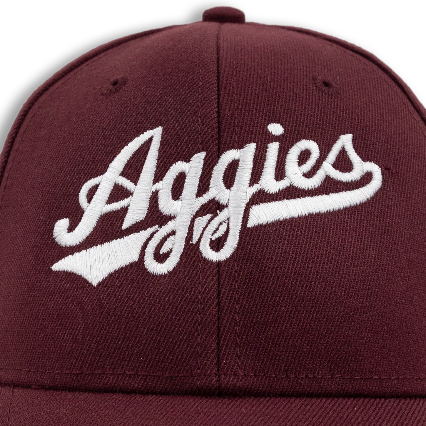
You are right. The baseball script is slightly different than the script used for basketball and others because it is more spaced out between each letter. Especially between the "i" and "e" you can see it. My only guess as to why is that baseball was the first to start using a script font again and therefore didn't change it when the other script was standardized across the athletic program
The baseball script is slightly different. There is a tail that "swooshes" under the wording, for starters. Basball is also slightly angled, raising up as you read across. And they have a "Texas A&M" and "Aggies" versions. The AGGIES script used by football and basketball is slightly different. Also, notice the "s" is slightly different between baseball and the FB/Basketball versions...
Baseball:
Basketball/Football:
And the baseball specific version is spread out slightly more. Probably to fit the jersey with the swoosh/banner underneath the wording...
Baseball Texas A&M script:
Football does have some apparel that they wear that has this Texas A&M script on it.
To me, b/c of the swoosh/banner under the wording, the baseball script just screams "baseball". I like them both but the baseball version is my favorite...
There is a tighter, small Aggies with the letter tighter and a shorter swoosh/banner:
I have seen this used by football on apparel and some baseball apparel issued to the team.