
Kind of a random topic, but I thought it might be fun to mix things up a bit. How would you rank the uniforms of each SEC baseball team? I won't include LSU out of biasness, but I think our jerseys are very good, especially the classic gold ones.
13. Tennessee- The Vols try to copy the Baltimore Orioles' look, but that hideous shade of bright orange doesn't look good on anything. Their home whites with pinstripes look good, but all of their other jerseys are hard to look at. Bad jerseys for a bad team. How appropriate. Overall Rating 3/10
12. Mizzou- I've only seen their jerseys once, so that's not really enough to form a good judgment. I don't have to see them to know that they are better than Tennessee's, though.
11. Kentucky- The Cats' uniforms aren't hideous like Tennessee's, but the generic "Kentucky" in block lettering across the chest makes nothing stand out about them. They look like the designers took about 5 minutes and thought, "Good enough". The royal blue jersey is sharp, but only the color makes it any different from their gray and white jerseys. The only unique jersey Kentucky has is a black one that says "Cats". Overall Rating: 4/10
10. Alabama- Their jerseys have barely changed in all the years I've been watching them. Very simple, classic look. The only one that is fairly new is the crimson jersey with "Bama" across the chest.
Overall Rating: 5/10
9. Arkansas- The Hogs keep it simple by only having three jerseys. The new font looks sharp and the red jersey is quite nice. Overall Rating: 6/10
8. Florida- The Gators' jerseys have changed a ton over the years. The newest versions look OK. They used to only wear grey and white, now they have orange and blue alternates. Overall: 6/10
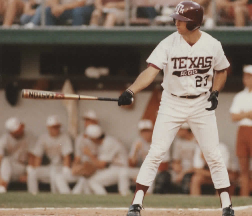
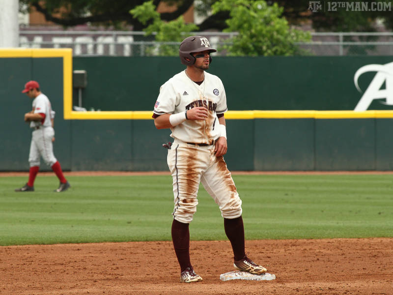
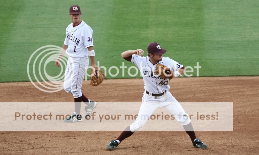
7. Texas A&M- Maroon and white isn't a unique color scheme, but the font looks sharp. The Aggies jerseys
don't stand out in a good or bad way compared to the others. The newer ones look sharp minus the pads in the pants. Overall: 7/10
6. Mississippi State- The Bulldogs are probably the only baseball team I'm aware of that doesn't wear gray jerseys for whatever reason. Ever. They wear maroon about 80% of the time. The only reason I rate them ahead of the Aggies is because they still wear the retro jerseys that Will Clark and Rafael Palmiero wore back in the 80s. Overall: 7/10
5. Vanderbilt- Vandy is a mixed bag. Most of their modern jerseys look nice, while their retro jerseys look hideous. All-black uniforms with gold pinstripes might be even uglier than Texas Southern's doozies the other night. They get bonus points for wearing patriotic jerseys on Sundays. Overall Rating: 7.5/10
4. Ole Miss- The Rebels are another team whose four jerseys have remained the same for years. The combo of red and navy blue looks just as good now as it did 150 years ago. Maybe someday they'll beat LSU in Baton Rouge again. Overall Rating: 8/10
3. Georgia- Red and black aren't unique colors in sports, or even within the SEC, but the Dawgs' uniforms have always looked sharp. Look a lot like the Cincinnati Reds. The grays and whites are classic looks, while the red and black are nice, modern alternates. The white jerseys hopefully remind Georgia fans of the time before their team became terrible (they used to consistently be the best team in the East in the mid-2000s). Overall: 8.5/10
2. Auburn- The Tigers' jerseys are simple, but the interesting number font really makes them pop. The cream uniform is sharp and the orange jersey is arguably the nicest in the SEC. Overall: 9/10
1. South Carolina- With five hats, seven jerseys, and four pants, the Cocks have the most uniform combinations in the SEC by far. They combine classic and modern perfectly, and bringing black back into the color scheme a few years ago was a great decision. The Gamecocks look great no matter what uniform they wear. Overall Rating: 9.5/10
13. Tennessee- The Vols try to copy the Baltimore Orioles' look, but that hideous shade of bright orange doesn't look good on anything. Their home whites with pinstripes look good, but all of their other jerseys are hard to look at. Bad jerseys for a bad team. How appropriate. Overall Rating 3/10
12. Mizzou- I've only seen their jerseys once, so that's not really enough to form a good judgment. I don't have to see them to know that they are better than Tennessee's, though.
11. Kentucky- The Cats' uniforms aren't hideous like Tennessee's, but the generic "Kentucky" in block lettering across the chest makes nothing stand out about them. They look like the designers took about 5 minutes and thought, "Good enough". The royal blue jersey is sharp, but only the color makes it any different from their gray and white jerseys. The only unique jersey Kentucky has is a black one that says "Cats". Overall Rating: 4/10
10. Alabama- Their jerseys have barely changed in all the years I've been watching them. Very simple, classic look. The only one that is fairly new is the crimson jersey with "Bama" across the chest.
Overall Rating: 5/10
9. Arkansas- The Hogs keep it simple by only having three jerseys. The new font looks sharp and the red jersey is quite nice. Overall Rating: 6/10
8. Florida- The Gators' jerseys have changed a ton over the years. The newest versions look OK. They used to only wear grey and white, now they have orange and blue alternates. Overall: 6/10
7. Texas A&M- Maroon and white isn't a unique color scheme, but the font looks sharp. The Aggies jerseys
don't stand out in a good or bad way compared to the others. The newer ones look sharp minus the pads in the pants. Overall: 7/10
6. Mississippi State- The Bulldogs are probably the only baseball team I'm aware of that doesn't wear gray jerseys for whatever reason. Ever. They wear maroon about 80% of the time. The only reason I rate them ahead of the Aggies is because they still wear the retro jerseys that Will Clark and Rafael Palmiero wore back in the 80s. Overall: 7/10
5. Vanderbilt- Vandy is a mixed bag. Most of their modern jerseys look nice, while their retro jerseys look hideous. All-black uniforms with gold pinstripes might be even uglier than Texas Southern's doozies the other night. They get bonus points for wearing patriotic jerseys on Sundays. Overall Rating: 7.5/10
4. Ole Miss- The Rebels are another team whose four jerseys have remained the same for years. The combo of red and navy blue looks just as good now as it did 150 years ago. Maybe someday they'll beat LSU in Baton Rouge again. Overall Rating: 8/10
3. Georgia- Red and black aren't unique colors in sports, or even within the SEC, but the Dawgs' uniforms have always looked sharp. Look a lot like the Cincinnati Reds. The grays and whites are classic looks, while the red and black are nice, modern alternates. The white jerseys hopefully remind Georgia fans of the time before their team became terrible (they used to consistently be the best team in the East in the mid-2000s). Overall: 8.5/10
2. Auburn- The Tigers' jerseys are simple, but the interesting number font really makes them pop. The cream uniform is sharp and the orange jersey is arguably the nicest in the SEC. Overall: 9/10
1. South Carolina- With five hats, seven jerseys, and four pants, the Cocks have the most uniform combinations in the SEC by far. They combine classic and modern perfectly, and bringing black back into the color scheme a few years ago was a great decision. The Gamecocks look great no matter what uniform they wear. Overall Rating: 9.5/10