
Jarrin Jay said:
That is a terrible aTm logo. The A and the M are way too offset. It looks cartoonish IMHO.
I actually prefer the now older aTm logo where the A and the M fit under the T as it emphasized the T, but the new logo with the A and the M centered under the downstrokes of the T looks good also.
Couldn't disagree more. It is the most "polished" and symmetrical/balanced logo we've ever had.
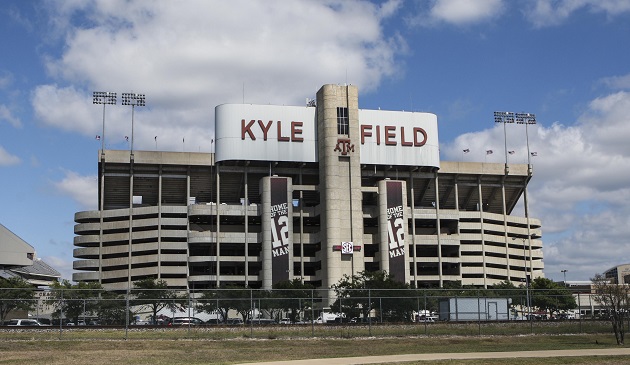
Used to be on the outside of Kyle Field.
To me it's a very strong logo. Like the Michigan "M", UT's "power T", or even Auburn's logo. Just clean and elegant.
I could live with the logo you're describing but I think this one is far superior.


/cdn.vox-cdn.com/uploads/chorus_image/image/45185896/usa-today-4622083.0.jpg)