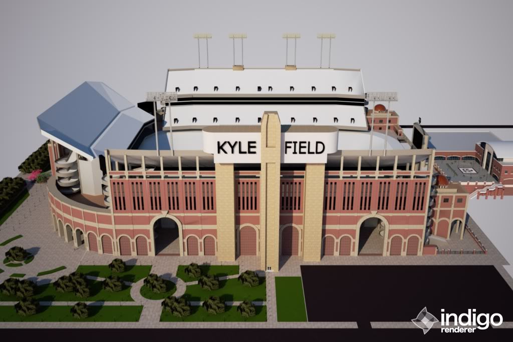
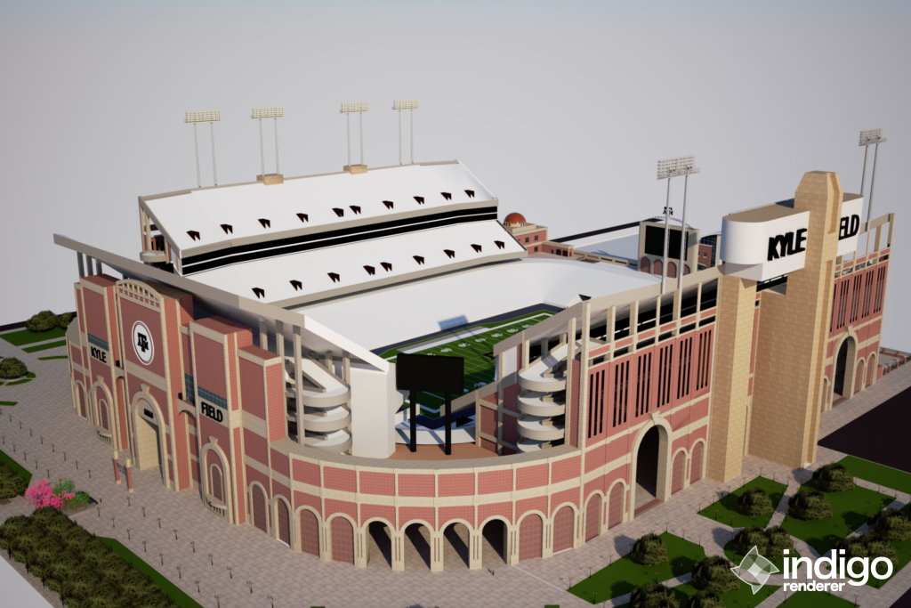
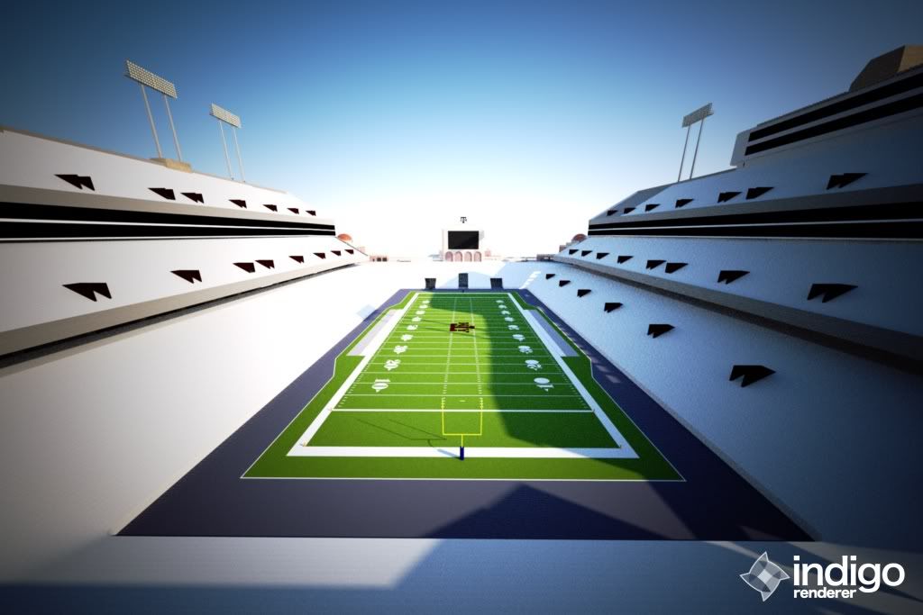
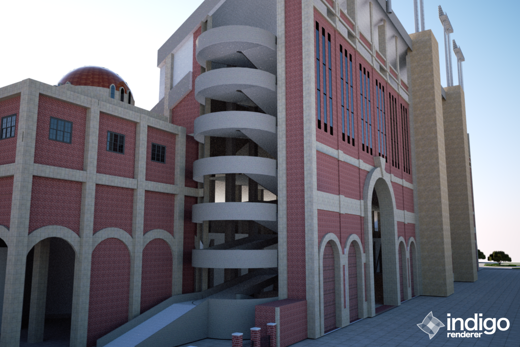
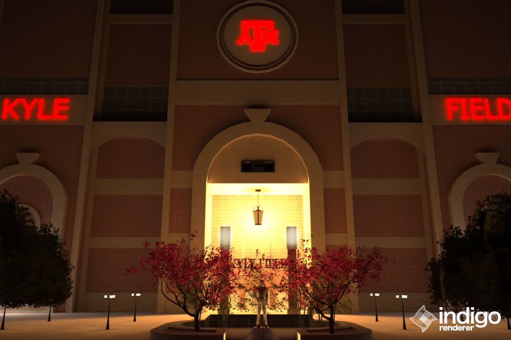
Howdy! I've been working on a few ideas for Kyle Field in my spare time, and I thought I would share them. This was just a fun little exercise, but I would like to get some feedback on it. I tried to model after the new Olson field, but also drew some influences from Ohio Stadium and the Rangers' Ballpark in Arlington (although I'm still and Astros fan)
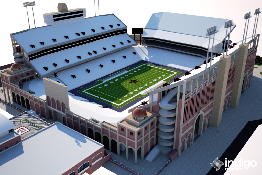
It would be a complete demo of the east and west stands and rebuild. This would be done in phases, instead of all at once. I had a prof hired to do an economic impact report for the school and said a season in Relient is most likely out of the question. I know some don't like the tackle box look, but I think it is unique and distinguishes Kyle Field from other football stadiums. The look would be the same, but with the addition of "wings" on each end of the stands that slightly wrap around the field, adding premium seats while creating a little uniformity. Each new section would add roughly 800 - 1000 seats adding around 4000 total.
The first deck would be completely enclosed, watching the first deck of the east/west stands and the zone. This would increase capacity by around 9000 seats. A large concourse/ viewing area would allow standing room only general admission ticket holders to watch from the south endzone. On top of this, first deck concourses would be increased as well. Club level dining/seating would be located in the two towers on the south end. These could be used anytime, in-game or for off-season functions.
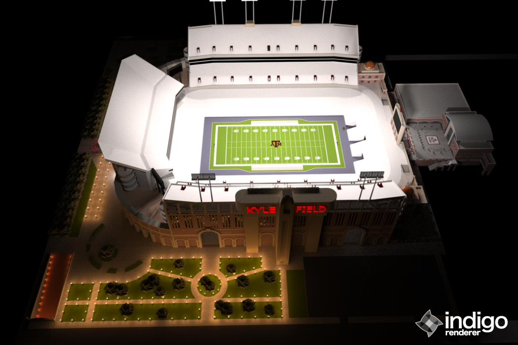
The real money maker is in the addition of private suites that wrap around to the student side. Although this would result in a loss of seats on the student side, the additions on either end would more than make up for this loss. This particular design would also increase entrance points around Kyle Field, creating greater traffic flow. On top of this, it will expand Freedom park, making it a prime tailgating location right next to the stadium.
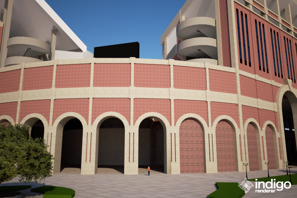
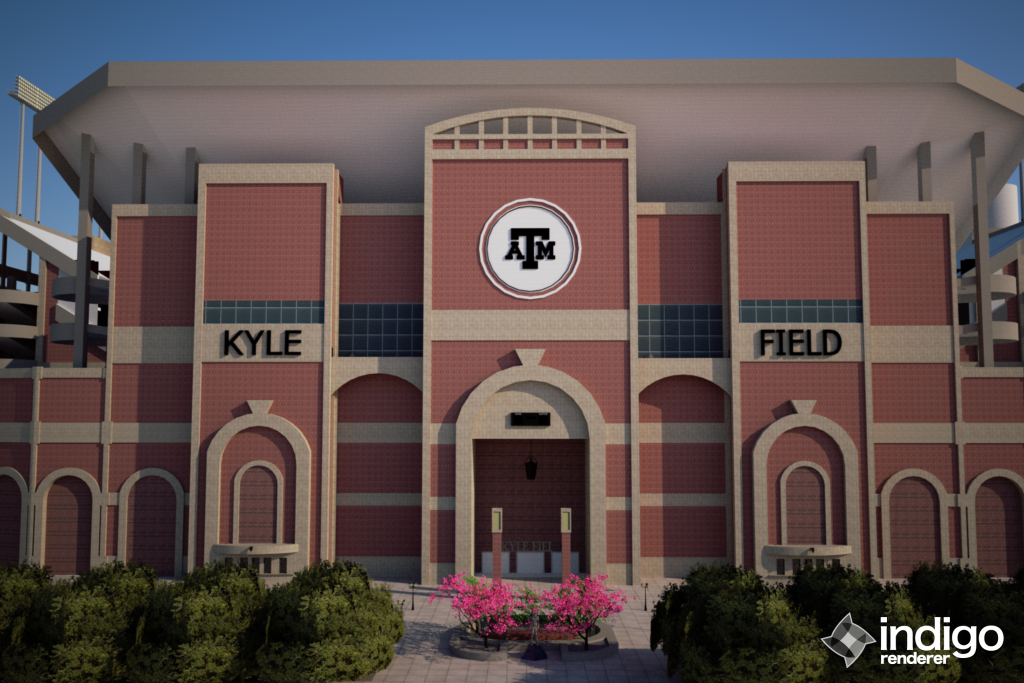
I gave the impression of a large, central tunnel in the Zone, but this is simply a restructuring of the facade. The more I look at the Zone, the more bland and boring it becomes. This restructuring would create uniformity in the design. And for those that care, the Reveille scoreboard is still there.
In all, this expansion/renovation would increase seating capacity to around 95,000, not including standing room only, with the ability to hold crowds over 100,000 if need be. With an ever increasing student and alumni population and the increase in visitor ticket allotments we will experience with our move the the SEC, this would provide much needed seating as well as a foundation for future expansion. Texags related because the letters light up.
http://s1165.photobucket.com/albums/q599/tlmilner12/?action=view¤t=kylewest.jpg
http://s1165.photobucket.com/albums/q599/tlmilner12/?action=view¤t=northwest.png
http://s1165.photobucket.com/albums/q599/tlmilner12/?action=view¤t=kylefieldinside.jpg
http://s1165.photobucket.com/albums/q599/tlmilner12/?action=view¤t=groundlevel.png
http://s1165.photobucket.com/albums/q599/tlmilner12/?action=view¤t=northeastground.png
http://s1165.photobucket.com/albums/q599/tlmilner12/?action=view¤t=southeast.png
http://s1165.photobucket.com/albums/q599/tlmilner12/?action=view¤t=kylezone.png
http://s1165.photobucket.com/albums/q599/tlmilner12/?action=view¤t=westnight.png
http://s1165.photobucket.com/albums/q599/tlmilner12/?action=view¤t=zone_night.jpg
Can someone repost these since I don't have photo posting privileges?


