
One of the things that annoys me about College Station but never seems to be brought up in this forum (of all the things to be annoyed about in terms of College Station) is the sign ordinance. I think it was put there to reduce clutter but somehow makes everything look worse instead of better. In most cities, when there's construction of a store or a restaurant or a gas station you get some sort of sign on a post with the store's logo. Take, for example, the classic Whataburger sign. (This one is in McAllen--source).

But instead of getting something like that, we get just something ugly like this. It's not even near the road.

Dairy Queen uses the term "Texas stop sign" in its advertising. I know the Bryan store at Villa Maria has recently been updated but it still the same structure and wasn't chopped down.

However, when the Dairy Queen in College Station was remodeled, it has just this at the bottom. (It used to have a real sign).

The classic Golden Arches (seen here in Navasota). I know that McDonald's has cheaper-looking signs nowadays (see Holleman and Wellborn) but the location at Southwest Parkway and Texas Avenue couldn't get theirs replaced because the sign had to be grandfathered in. It looked similar to this (in Navasota).

...resulting in a mutant half-sign like there is now. Unique, sure, but that's not necessarily a compliment.

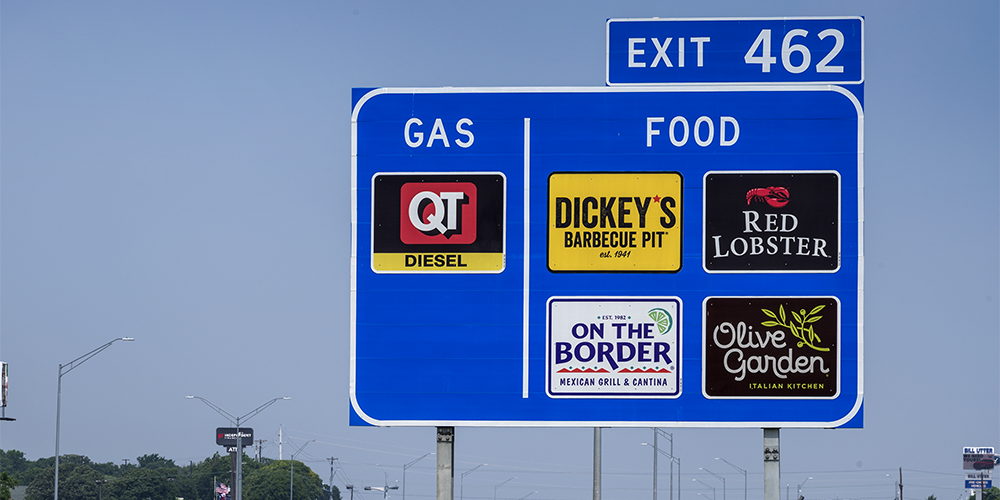
On road trips involving freeways, hotels and restaurants have tall signs, especially if they're not that visible from the freeway. It's cool-looking and they drive business to the area. (This is Bellmead on I-35).

But in College Station, even in the highly commercialized intersections like William D. Fitch Parkway you'd hardly know anything was there. The closest thing is the "dual prong" Exxon sign, which is much shorter than other examples I've seen. I used to think that not replacing the McDonald's logo with Mooyah's was just laziness, now I think they genuinely can't.

This is what the signage for the local Cavender's Boot City looks like.

But for other stores, even more recently built ones, they look like this (source).

Victoria's store was built in the mid-2010s and the signage even waves.
Based on the McDonald's sign issue, this has been in place for at least twenty years from a council that no longer exists (though may have been modified). The question--why? No one's house is at risk for a giant Shell sign (or whatever) towering over them, and if it was to reduce """blight""" they've replaced it with something worse. Combined with the color scheme issue (it looks like, based on New Development, the new Hampton Inn cannot have blue accents), it makes the city look extremely unremarkable. There are rumors on TexAgs that the city is hard to work with on new businesses, and with overly strict rules, it's not hard to see why. Why is no one pushing to repeal this? Why can't we get cool signs like almost every other city, even Bryan?
edit: fixed Victoria link
But instead of getting something like that, we get just something ugly like this. It's not even near the road.
Dairy Queen uses the term "Texas stop sign" in its advertising. I know the Bryan store at Villa Maria has recently been updated but it still the same structure and wasn't chopped down.
However, when the Dairy Queen in College Station was remodeled, it has just this at the bottom. (It used to have a real sign).
The classic Golden Arches (seen here in Navasota). I know that McDonald's has cheaper-looking signs nowadays (see Holleman and Wellborn) but the location at Southwest Parkway and Texas Avenue couldn't get theirs replaced because the sign had to be grandfathered in. It looked similar to this (in Navasota).
...resulting in a mutant half-sign like there is now. Unique, sure, but that's not necessarily a compliment.
On road trips involving freeways, hotels and restaurants have tall signs, especially if they're not that visible from the freeway. It's cool-looking and they drive business to the area. (This is Bellmead on I-35).
But in College Station, even in the highly commercialized intersections like William D. Fitch Parkway you'd hardly know anything was there. The closest thing is the "dual prong" Exxon sign, which is much shorter than other examples I've seen. I used to think that not replacing the McDonald's logo with Mooyah's was just laziness, now I think they genuinely can't.
This is what the signage for the local Cavender's Boot City looks like.
But for other stores, even more recently built ones, they look like this (source).
Victoria's store was built in the mid-2010s and the signage even waves.
Based on the McDonald's sign issue, this has been in place for at least twenty years from a council that no longer exists (though may have been modified). The question--why? No one's house is at risk for a giant Shell sign (or whatever) towering over them, and if it was to reduce """blight""" they've replaced it with something worse. Combined with the color scheme issue (it looks like, based on New Development, the new Hampton Inn cannot have blue accents), it makes the city look extremely unremarkable. There are rumors on TexAgs that the city is hard to work with on new businesses, and with overly strict rules, it's not hard to see why. Why is no one pushing to repeal this? Why can't we get cool signs like almost every other city, even Bryan?
edit: fixed Victoria link