
Noticed this in a news article and they seem to be doing it more and more. When NPR presents a map of the US, comparing laws or trends, they make every state the same size and represent it as a hexagon. That way, conservative opinions seem minimized.

They also use red and blue strategically - when being "for" something is to be viewed positively (to them), it's blue. When being "for" something is negative, they make it red.

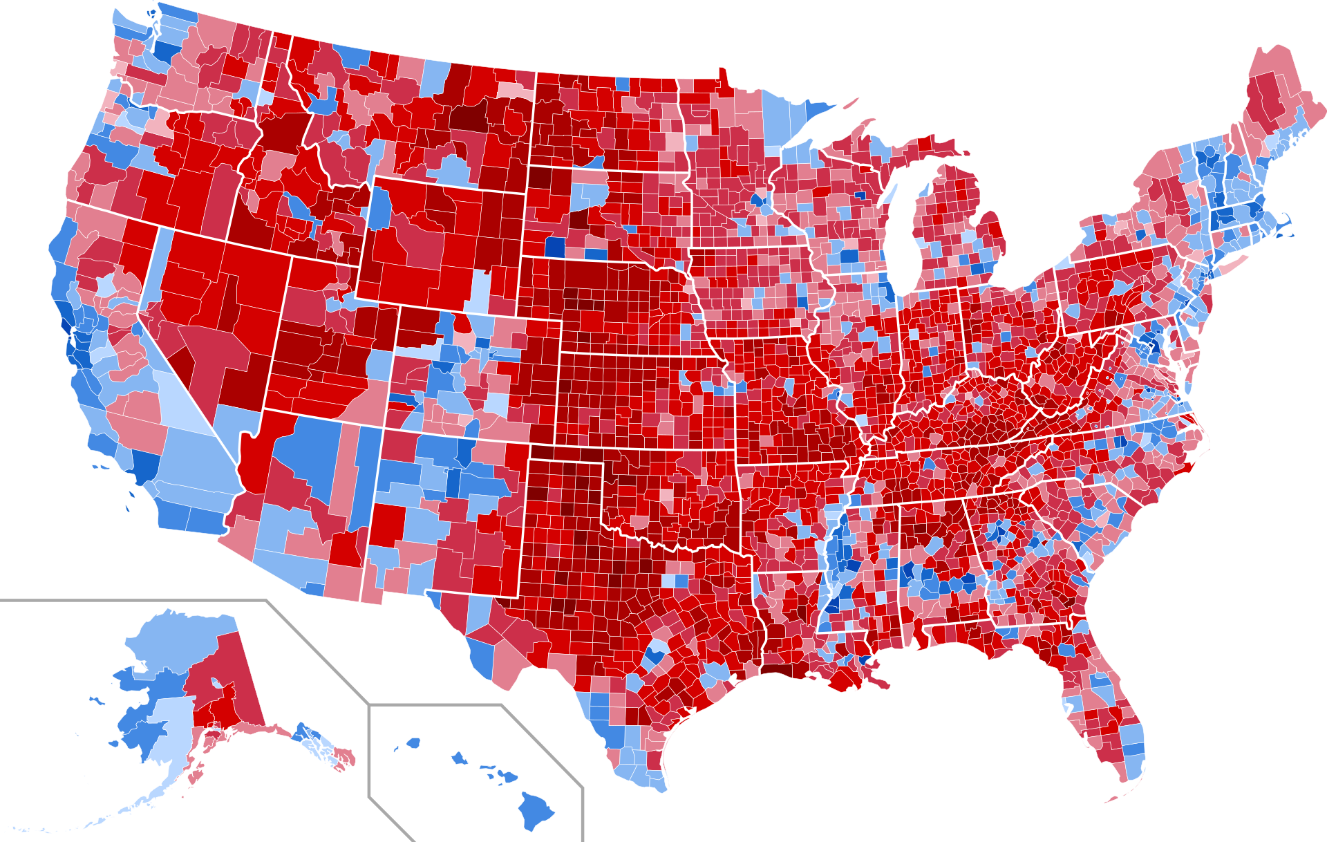
I guess they got tired of maps like this.
They also use red and blue strategically - when being "for" something is to be viewed positively (to them), it's blue. When being "for" something is negative, they make it red.
I guess they got tired of maps like this.

