Texas A&M Football
Sponsored by

Four versions of the Texas A&M logo inside the state silhouette...

139,684 Views | 238 Replies | Last: 4 yr ago by monarch
Bocephus85
How long do you want to ignore this user?
AG
quote:
Bocephus85?


I like it, but I think the AMC still needs to be a little bigger. Like so...


"Always do right- this will gratify some and astonish the rest."
- Mark Twain
maroonboots
How long do you want to ignore this user?
Personally, I like the helmet Brett made.

Well done. Blue star for you!
Old Main
How long do you want to ignore this user?
AG
This is from texasags08...


jaypunkrawk
How long do you want to ignore this user?
AG
Maybe shrink the logo a bit, but I like it.
Aston04
How long do you want to ignore this user?
AG
I like the idea of using "A&M" with the state of Texas in the background. "A&M" should be in big bold letters.

(The sample someone posted like this is ok, but needs serious help)

I would also experiment with the Texas flag colors in the background.. with perhaps A&M in maroon or white)..

Why should we consider moving to marketing simply "A&M"? Because to most we are simply known as "A&M".. That's really what are known as. If one hears "A&M," they instantly think of us-- even to people in Michigan or wherever. Plus, a logo like this more effectively "claims" the state for casual fans using the state map as a background. Also, this logo would eliminate the atm machine confusion problem.

I do know our current marketing is terrible. The block T is the best known logo for A&M outside the state. If you look at logos that are popular, they are sharp and crisp like the block aTm. There is no popular logo with beveling. None. Worse, the T Star is not even recognizable to most in Texas- because it doesn't give any obvious representation of our school. It could be a generic logo for any Texas affiliated school.. That's not good. That's really bad in fact.
nacho10
How long do you want to ignore this user?
AG
http://www.amazon.com/Texas-Aggies-Shaped-Chrome-Emblem/dp/B002DWQBX8/ref=sr_1_6?s=automotive&ie=UTF8&qid=1316132818&sr=1-6

these are pretty cool, got one earlier this year.

txag70
How long do you want to ignore this user?
AG
Let’s get something straight. The old A&M logos were not scrapped because something better came along. The old logos (everything from Old Sarge and the block T to the un-beveled aTm and the spider AMC) were trashed because some “Visualization major” (whatever the hell that is) thought they were old fashioned, out of date, not contemporary enough. That’s the ONLY reason we got the damned beveled T and T-Star in the first place.

It's also from the same folks who decided we had to be the redundant Texas A&M Aggies.

And, of course, when those graphic artists’ (what they were called before they got computers) designs are criticized, we get gobbledygook and insults like…

quote:
… it seems that us Viz majors are the only ones who understand aesthetics.
and
quote:
One of the first Gestalt design principles you learn in Graphic Design is implied forms. We are implying that the T is beveled without making an overly gaudy icon.
and
quote:
There are so many factors you must think about in logo design that none of you have addressed. Please leave this to the professionals that we have working in Marketing.


Yada, yada, yada. The usual BS from someone trying to justify his “art” with claims that anyone who doesn’t like or "understand" it is a Neanderthal.

Heard that same gobbledygook from the folks who designed the Edsel when the American public collectively said, “That’s flat out ugly.” It’s also the same thing the designers of the latest football uniforms say when you look at Maryland and say, “What the hell?”

Traditional logos are not to be changed on the whim of some “viz major” trying to make a name for him/herself. ‘Viz majors’ would tell Michigan to ditch the old fashioned helmet design for something more contemporary and “aesthetic”, tell Penn State they needs some snazzy graphics on their helmets, tell tOSU they need to update the block O, and tell Alabama that putting numbers on helmets doesn’t follow “Gestalt design principles you learn in Graphic Design is implied forms.” For some reason A&M listened to them.

Part of the fact tu has so successfully branded themselves it they have had the same, simple longhorn logo for years. They didn’t try to modernize it, change it, make it more edgy. We’ve let the marketing people toss out one stupid idea after another, abandoning one as soon as they come up with the next.

Stuff it, “viz majors”. Your new designs suck, despite your insults and attempts to justify change for the sake of change with pure BS.

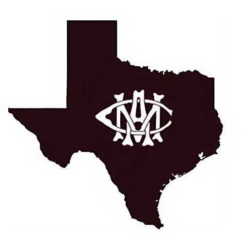
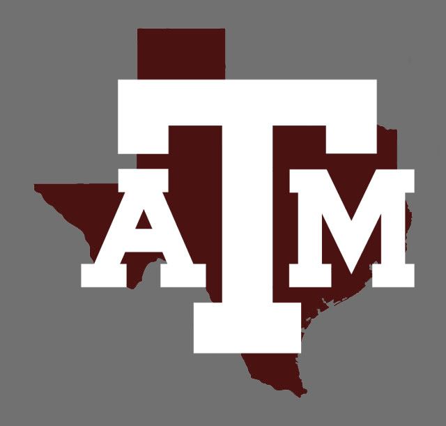
That being said, Brett’s Texas outline with the larger aTm is growing on me, especially the helmet layout. Just don't let a "viz major" get hold of it.


[This message has been edited by txag70 (edited 9/16/2011 8:10a).]
Hi, Im Brett
How long do you want to ignore this user?
AG
Let me just say I enjoy messing around with Photoshop to kill time. OP stated he liked the state silhouette and smaller letters so i made a quick logo.

My personal feeling is we need consistant branding and this should be it...


No bevels.

If we want a secondary logo with the State of Texas for sports, etc. I would use the same ATM layout. Maybe something like this...


[This message has been edited by Hi, Im Brett (edited 9/16/2011 11:45a).]
txag70
How long do you want to ignore this user?
AG
I agree, Brett. Keeps the traditional, simple, solid aTm, good balance between the sizes of the T and the A & M, good placement of the letters in relationship to each other.

The Texas state outline adds to the "we ARE Texas' first school and we're proud of it" statement.

And I think it looks great on a helmet.

It's not change for the sake of change like bevels and T-stars.
GEA89
How long do you want to ignore this user?
AG
The fact that some people even talk about the bevel is gay. It is even more gay that there are people with energy behind it.

Kick off those pumps, put your purse down, and ease up ladies. You aren't changing it back no matter how much you complain. The marketing department is in charge and if they didn't care years ago when they changed it they sure do not care now.
Hi, Im Brett
How long do you want to ignore this user?
AG

^^^Damn dude relax, It's just the internet. Why you so mad??
Davism98
How long do you want to ignore this user?
AG
Could one of you Viz Majors mock up a Bevel Saw 'Em Off logo? Just for random absurdity ...

XpressAg09
How long do you want to ignore this user?
AG
So I got bored and thought I'd test out the marketability and/or feasibility of the fourth logo on page 1. Got an email reply (edit: from the sticker people) in 12 minutes on a Friday afternoon (slow day?).

And it sounds like they can make "any original design" (so long as it's not copyrighted I'd imagine).

I can see us doing the block T on Texas background but ATM may be copyrighted (experts?).

Lots of people are throwing the ideanofngetting some made and it sounds like the maroon with white lettering is favored.

How serious were you characters about buying?

[This message has been edited by XpressAg09 (edited 9/16/2011 5:09p).]
Davy_Crockett
How long do you want to ignore this user?
AG
Several local places in BCS and elsewhere are licensed to make/sell the copywrited stuff. They can custom make it legally. Just have to call around.
RLM.Boise
How long do you want to ignore this user?
Good work guys.
I like vintage, but the AMC is all wrong for the simple reason we've quit being a COLLEGE back in the 60's.
RLM.Boise
How long do you want to ignore this user?
If you're into marketing/design any, this is a cool site:
http://best-ad.blogspot.com/2008/08/evolution-of-logos.html
Microsoft's has come along way.
Davism98
How long do you want to ignore this user?
AG


Clean, efficient.
Too simple?
monkeyaround
How long do you want to ignore this user?
Wow, I hope none of you guys actually work in graphic design or marketing. Most of these proposed logos are gawd awful. Thankfully, none of you have any actual influence about such things. At least I hope not.(:
Old Main
How long do you want to ignore this user?
AG
When we use the T-Star logo I think something this this with TEXAS AGGIES would be best (but in a more collegiate font):


Here is a clean version of the intertwined AMC logo:


[This message has been edited by Old Main (edited 9/20/2011 2:03p).]
Old Main
How long do you want to ignore this user?
AG
Here is the state silhouette background from the Texas A&M/SEC celebration/press conference. Personally I think it would look cleaner without the bevel T, but that is just my opinion. Overall I think it is still a sharp backdrop.


AggieGrandson44
How long do you want to ignore this user?


[This message has been edited by AggieGrandson44 (edited 9/26/2011 9:32p).]

[This message has been edited by AggieGrandson44 (edited 9/26/2011 9:33p).]
ShreveportTiger
How long do you want to ignore this user?
I would say the maroon Texas with the white "T" so as to suggest that yall are Texas, not Texas A&M but Texas. Start taking it back now; always refer to UT as UT Austin. Make UT specify "what Texas" they are.
Old Main
How long do you want to ignore this user?
AG
This Old Sarge logo is sharp!


Falcon09 created this logo...


pv
How long do you want to ignore this user?
Love it. MERCH!
CC Creations
How long do you want to ignore this user?
Do know that we have some flags with some graphics that you have posted on here?

http://www.cctentsale.com/TentSale/Products.aspx?CatId=110

Sponsor Message: CC Creations - Official Apparel Partner of TexAgs.com | CC's Tent Sale is now online
XpressAg09
How long do you want to ignore this user?
AG
I know a guy who knows a guy who whipped this up:

Thoughts?


Edit: fail.

[This message has been edited by XpressAg09 (edited 9/28/2011 8:53p).]
fig96
How long do you want to ignore this user?
AG
Wow...lot of hate flowing here. There actually are considerations for a logo for marketing purposes other than whether you personally like it or not, however. Stereotyping every designer as bad because they did something you don't personally like is, well, dumb.

(BTW, for all the "viz majors" you may be interested to know that a whole lot of former architecture students are now working graphic designers, we worked our asses off and learned it on our own. And why are we putting "viz majors" in quotes anyway?)
Pet Sounds
How long do you want to ignore this user?
Old Main
How long do you want to ignore this user?
AG
https://www.cctentsale.com/TentSale/Products.aspx?CatId=110

CC Creations...I like those two flags! Are you going to make t-shirts with these two designs?

Don't like the bevel T aTm logo on the flags. Can we finally dump that logo now? No bevel T in the SEC!

Has anyone every refused to buy Aggie merchandise because it didn't have the bevel T logo on it?


[This message has been edited by Old Main (edited 9/29/2011 6:32a).]
Baron Von Karbach
How long do you want to ignore this user?
AG
Just put a white Texas outline on the shoulder of the jerseys. Very visible without being too much. (come the **** on texas on the helmet that's too much man)
Sparkie
How long do you want to ignore this user?
karlthomas
How long do you want to ignore this user?
BUMP!


Class of '07
College of Architecture
XXX Rodeo
How long do you want to ignore this user?


[This message has been edited by XXX Rodeo (edited 12/12/2011 5:48p).]
AggieTravis12
How long do you want to ignore this user?
AG
I would buy stickers, tshirts, car emblems, etc with this on it.

gator2ag03
How long do you want to ignore this user?
Where can I get that maroon Texas with the Block T window decal? That is nice!
 
×
subscribe Verify your student status
See Subscription Benefits
Trial only available to users who have never subscribed or participated in a previous trial.