quote:
If people outside the state of Texas are mistaking a maroon T for tu then we have a lot of work to do on our national image. In my opinion most people know that the sips are burnt orange. I also think the sips have gotten away from using U and T in their logos. Everything I see for tu is the simple longhorn logo.
The only confusion I can see is that maybe people would confuse the orange T of Tennessee with the burnt orange T of tu, but because the sips use the longhorn logo there isn't much confusion anyway.
I agree with you that the bevel T looks unfinished. I don't know if it is just the missing bevel highlight on the inside left serif or something else.
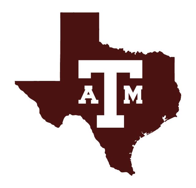
I'm not trying to replace the block aTm - it is my favorite logo. I'm just experimenting with some different ideas for secondary logos, mostly trying to incorporate the state silhouette and the lone star.
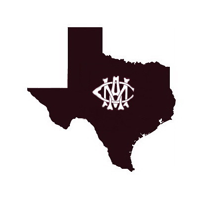
I think there are ways to distinguish the block T (without the A and M) so no one confuses it with another university. If you see a maroon T with a state silhouette behind it should be recognizable as Texas A&M. I don't think anyone is going to mistake the logo below for any other school (even without the seal).
Trust me, we need to work on our national image more than you realize.
Now, I'm not into marketing at all, but to me it seems that keeping the image simple, classic and the same is the single best method at getting that image recognizeable. Look at McDonald's for an example - the simple golden arches haven't changed, and their marketing has them all over the place.
Having secondary images is fine, but there should be one singular logo that is unequivocably Texas A&M - and that should be the tried and true ATM logo.
The block T doesn't instantly scream Texas A&M - especiallyl if you get outside the state of Texas. It's too simple, and in all reality the block T sitting inside the state (while it does look good, don't get me wrong), has too much of a high school feel to it for me. It's not instantly recognizeable as Texas A&M - it could very well mean A&M, but then it could mean Tarleton, Temple High School, Tyler High, etc, etc, etc (I grew up in Texas and couldn't tell you school colors for anything other than my high school and the couple of rival schools - there are just too many of them). It would take a very concerted, expensive and long duration marketing campaign to have that as a truly recognizeable Texas A&M logo. That's the downside to it in my opinion (which may or may not have worth - I'm just voicing it for the hell of it).
The block ATM, however, is unmistakeable - even outside the state. With the impending move to the SEC, this really could be an opportunity for the school to formulate it's brand recognition as we stand to suddenly find ourselves exposed to a much larger and more diverse audience.
As for a secondary logo, the block T with some other aspect (A&M seal), the intertwined AMC does offer a more refined look, etc. What you don't want to do is end up with so many logos that you lose brand recognition with them. At least from a non-marketing education standpoint as a consumer anyway.
Just my opinion - and actually some of the other ideas are very good ones on this board. Well, except the beveled T. I still hate that one, and probably still would even if all the corrections were made.