Texas A&M Football
Sponsored by

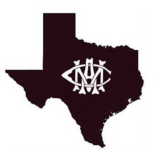
Four versions of the Texas A&M logo inside the state silhouette...

139,683 Views | 238 Replies | Last: 4 yr ago by monarch
Hi, Im Brett
How long do you want to ignore this user?
AG
Curiosity got the best of me...


[This message has been edited by Hi, Im Brett (edited 9/15/2011 9:24a).]
jmg3
How long do you want to ignore this user?
AG
jaypunkrawk
How long do you want to ignore this user?
AG
Helvetica >> Arial
Kentucky Mustangs
How long do you want to ignore this user?
BeardedBear,

no skill, but looking at your Red, White, Blue version..

where the copyright logo is, substitute a circular SEC logo like in Old Main's sig file, and center it right on college station. Move the large aTm logo around so it fits visually

just a thought
MW03
How long do you want to ignore this user?
AG
quote:
Please leave this to the professionals that we have working in Marketing.


No.
Hi, Im Brett
How long do you want to ignore this user?
AG

quote:
There are so many factors you must think about in logo design that none of you have addressed. Please leave this to the professionals that we have working in Marketing.


What are your thoughts on this logo...


jmg3
How long do you want to ignore this user?
AG
I would be happy to.

First issue: The Bevels.

First know that the marketing department HAS listened to you and explored bevel options (every direction, all bevels, less bevels, etc). It looks horrible. Trust me. Please remember, it's a logo. It is not a perfect 3D model of a bevelled T with one light source. A logo should be simple and recognized in less than a second. It should be legible at very small sizes. It should be able to be used in black and white as well as color. I could go on but I doubt you all care. Having more bevels complicates the logo and clutters it. The current set up implies emphasis on the T so you see it in the right order. You want to see the T first and then the A&M. Otherwise one might read the logo as atm and then come for money. One of the first Gestalt design principles you learn in Graphic Design is implied forms. We are implying that the T is bevelled without making an overly gaudy icon. And honestly, no one but people with the internet and nothing better to do at work would ever notice or care.

Issue 2: the placement of the A&M.

Now this one bugs me the most. In the past, the A and M were always trying to find their place within the T. Notice that the most aesthetically pleasing placement is centring the elements under the serif of the T (current set-up). Also notice the size of the serif, is the same as the top of the A and counter (negative space) of the M. They are proportional and serve every purpose that they need to. They let the T speak first as well as stand their own and make a solid logo element when looked at from a distance. If they were smaller, they look weak and lost. If too big, we are emphasizing letters that...don't stand for anything any more...

So all said and done, the current aTm is the evolution of lots of years of work. We are just now starting to gain some creative people to come to college here. I love A&M and I love our quirks. We are traditionally...not creative. However to become a top school, we need to start . If you look at most top schools, they most likely have an art school or at least a creative program. Our logo is a perfect blend of strong, traditional, historical, boldness (shown in the blocky structure) and new aesthetically pleasing, good graphic design elements. We are trying to be a top school, and I think our current logo is going to take us there.
jmg3
How long do you want to ignore this user?
AG
But to reply to the OP, I do think taking the ownership of Texas is a GREAT idea. And I wouldn't be surprised if the Marketing division knew this, and agreed with this.
Old Main
How long do you want to ignore this user?
AG
jmg3,

I respect your opinion but I disagree with you on using the bevel T logo and leaving it up to the marketing professionals (who gave us this bevel T logo). You just admitted there are problems with the bevel T logo. I think you said it was horrible (or maybe you meant just the bevel highlights were horrible). In my opinion if the bevel T logo is the one we are sending out to every media outlet in the country it should be absolutely perfect. If we want to keep it simple and traditional eliminate the bevel highlights and just use the block aTm that is on the helmet.


[This message has been edited by Old Main (edited 9/14/2011 6:07p).]
MW03
How long do you want to ignore this user?
AG
quote:
I love A&M and I love our quirks. We are traditionally...not creative. However to become a top school, we need to start . If you look at most top schools, they most likely have an art school or at least a creative program. Our logo is a perfect blend of strong, traditional, historical, boldness (shown in the blocky structure) and new aesthetically pleasing, good graphic design elements. We are trying to be a top school, and I think our current logo is going to take us there.


Well then they should have never gotten rid of the journalism school, because nearly everything you posted was part of the curriculum I studied while I was there under that major. Granted, it may have just been reading "Stop Stealing Sheep and Learn How Type Works" and dilling around with design elements in the lab, but it was what it was.

schmellba99
How long do you want to ignore this user?
AG
quote:
This thread makes it so obvious that Texas A&M has no creative people. The only thing that comes close is Visualization majors (we actually get to study logo design). And most of the time, it seems that us Viz majors are the only ones who understand aesthetics.

Everything posted previously are either old logos (that were scrapped for very good reasons) or new creations that look like they were designed by an engineer who stumbled upon an old copy of Photoshop CS3. There are so many factors you must think about in logo design that none of you have addressed. Please leave this to the professionals that we have working in Marketing.


1. Last I checked, this thread was a bunch of folks more or less killing time during the day. Didn't realize it was a message board for logo design professionals.

2. Our marketing departmen blows goats. It has for eons, and apparently they are too close minded to realize that they suck. The beveled T looks like crap. I realize that the 'creative' types always feel the need to change things, but the dumping of the classic tried and tru, uber recognizeable Block ATM was a huge mistake. Additionally, as Old Main pointed out, our school has multiple logos that they send out, which is generally a marketing feaxupaux (or however the hell you spell it). Brand recognition doesn't like several different designs for the same company, school, etc. That's why you don't see multiple versions of tu's longhorn emblem, multiple versions of Notre Dame's logo, multiple versions of Green Bay's logo, etc.

Sometimes, simple is far and away the best. The K.I.S.S. principle is still very valid and should be adhered to much, much more.

I lived way outside the borders of Texas for 6 years and can attest that few people outside of the state recognize most of A&M's logos - but they do recognize the non-beveled Block T. I can also attest that our marketing department, as a whole, is not very good at their job. tu, on the other hand, is leaps and bounds ahead of us in this department, and as a result they are also leaps and bounds ahead of us financially.

3. Nobody likes it when the "expert" comes in and makes a statement in the manner you did. Everybody knows that guy that is evidently smarter, better, has done more of XXXX activity, etc. And generally that guy isn't liked. If you are the self appointed expert, show us lowly engineers and what not how to do it properly.
S.A. Aggie
How long do you want to ignore this user?
AG
I like the one J_R posted. The maroon State of Texas with the block ATM in white/maroon.
pv
How long do you want to ignore this user?


SOMEONE PLEASE MAKE HATS


Hi, Im Brett
How long do you want to ignore this user?
AG
quote:

So all said and done, the current aTm is the evolution of lots of years of work.


LOL, you come on here and compare what is essentially a brainstorming session to a logo professionals have spent years on and still haven't perfected?


When you introduce something as irregular as the state of Texas your negative space gets a little f'd.


I centered the simplified state outline around the "T" trying not to make either one too dominant while balancing the negative space around the letters "A"&"M" inside the state of Texas while ALSO centering them equally under the "T". All with one color and I spent about 15 mins on it; sorry if it's not perfect.

small


B&W


[This message has been edited by Hi, Im Brett (edited 9/15/2011 9:25a).]
Rock1982
How long do you want to ignore this user?
AG
Brett,

Looks really good. Feel certain that a helmet like those would be something the players would really like. Pride in Texas. Proud to be a Texas Aggie.

[This message has been edited by Rock1982 (edited 9/14/2011 6:44p).]
Old Main
How long do you want to ignore this user?
AG
The bottom line is that an imperfect logo (like the bevel T) should not be sent out to every media outlet in the country. You'll see that bevel aTm logo on every channel this weekend.

Here is the corps brass logo in the state silhouette...


Brett, I think this looks sharp!


[This message has been edited by Old Main (edited 9/14/2011 6:48p).]
wee_ag
How long do you want to ignore this user?
AG
jmg3 - really? You do realize that this is a fan site, where we fans actual get excited, have fun ideas and enjoy getting creative with those ideas.

Did you make an account JUST to post those thoughts? Please just let us enjoy ourselves.
pv
How long do you want to ignore this user?


awesome. well done. i want merch!


Old Main
How long do you want to ignore this user?
AG
If this logo (our current primary logo seen nationwide) is the result of many years of evolution and work I am really concerned about the direction of our marketing department. If I were to guess I think at least 50% of Aggies dislike this logo. If we have to follow Texas Tech (for some reason) and put out a bevel T logo let's at least get the highlights correct.


aggiemom2011
How long do you want to ignore this user?
S
Bocephus85?


and let me try that code again..

[This message has been edited by aggiemom2011 (edited 9/14/2011 9:02p).]
aggiemom2011
How long do you want to ignore this user?
S
I like the block aTm better myself, though there are some really good ones here
schmellba99
How long do you want to ignore this user?
AG
The helmets just remind me of the TSU helmets from "Necessary Roughness" movie that was made back in 89 or 90. Just something about it.

Yep, the block ATM just has that classic look that should be what we promote. In my opinion, of course.
12th Ag
How long do you want to ignore this user?
AG
How about just putting "A&M" inside the sillhouette without the "T". The sillhouette and the T are redundant.
12th Ag
How long do you want to ignore this user?
AG
How about just putting "A&M" inside the sillhouette without the "T". The sillhouette and the T are redundant.
aggieband 83
How long do you want to ignore this user?
AG
quote:
I guess I just don't understand the hate for the beveled T.
Because it is a cheap re-do of the beveled T that tech uses. The T-star looks like something high school students would do in art class when they are bored.

I always liked the aTm inside the state of Texas logo that was on the baseball uniforms. Very classy.

If anyone reading this thread works for the branding dept. for Texas A&M, please trash the beveled T and that crappy T-Star. Wipe them from this school and NEVER let them surface again.

What really bothers me is that Texas A&M owns the copyrights to the solid block T and the phrase "Texas Aggies" but they do not market them as aggressively as that other junk. They keep looking for a catchy, flashy brand when they already have it. We are "Texas Aggies" use it!
stetson
How long do you want to ignore this user?
AG
I'm with schmellba on this. Our marketing sucks and our creativity blows. This is a large part of why we do not have many t-shirt fans. We need to see this coming SEC paradigm shift as an opportunity to think outside the box and transform our logo. 60 year-old blocks are not it Aggies.
Old Main
How long do you want to ignore this user?
AG
12th Ag,

MW03 made one like you described...


I would like to see this one on more t-shirts.


[This message has been edited by Old Main (edited 9/14/2011 11:36p).]
RLM.Boise
How long do you want to ignore this user?
Thanks and blue stars for all for the graphics and photoshop work, Old Main and Bret. I'm sure it took some time.

I'm dating myself here a bit, but I too would love to see the block-T with Texas Aggies with the emblem on t-shirts again.

Brett, I think your 1st helmet pic of aTm inside the white border Texas (at the top of this page) you did looks like the best so far. It makes a great helmet logo and would be awesome on the 50yrd line, mid-court or the behind home plate.

[This message has been edited by RLM.Boise (edited 9/14/2011 11:56p).]
jaypunkrawk
How long do you want to ignore this user?
AG
The incorrect bevel highlights have always bothered me since I was a student, but that's probably because I'm an engineer with an insane eye for detail, however I understand the point about simplification. A logo should be as simple as possible. In this vein, the bevel probably isn't necessary, but if it's going to be there, it should be simplistic.

By the way, schmellba99, it's faux pas, however, I loved your spelling!
Aggie1
How long do you want to ignore this user?
AG
Old Main is right, we need to bring back Old Sarge in as many ways as possible...

Along with "Texas Aggies"

the State of Texas with a white ATM on the helmet is really nice!!
Old Main
How long do you want to ignore this user?
AG
Does it make the logo that much more complicated if you correct the highlights? It is supposed to be a better logo because highlights are missing?

I say let's just scrap the bevels. If simple is what we are after then let's just use the block aTm like we have on the helmet. The bevel T logo looks like crap when they show A&M highlights on TV.


[This message has been edited by Old Main (edited 9/15/2011 12:19a).]
hurricanejake02
How long do you want to ignore this user?
AG
One I drew up a few years ago... obviously still rough

heisatouchdown
How long do you want to ignore this user?
AG
Hmmmmm... I may have a weekend project with the old Texas flag and the Texas A&M stylized on it.
MW03
How long do you want to ignore this user?
AG
quote:
Does it make the logo that much more complicated if you correct the highlights? It is supposed to be a better logo because highlights are missing?


I monkeyed with the bevels a bit last night during a bout of insomnia, and I could not get a version that looked decent. When reduced, the PNG looked off. To that end, in miniature, the current logo is probably the best in terms of the bevels in that you get the idea but still make out the outline space.

[This message has been edited by MW03 (edited 9/15/2011 9:21a).]
Old Main
How long do you want to ignore this user?
AG
http://polldaddy.com/poll/5505698/

Above is a poll SpreadsheetAg set up to see if Aggies like the bevel T logo. So far it is not looking good for the logo below.


[This message has been edited by Old Main (edited 9/15/2011 9:32a).]
 
×
subscribe Verify your student status
See Subscription Benefits
Trial only available to users who have never subscribed or participated in a previous trial.