2016 Uniforms

7,764 Views | 32 Replies | Last: 8 yr ago by jpc08
awschux
How long do you want to ignore this user?
AG
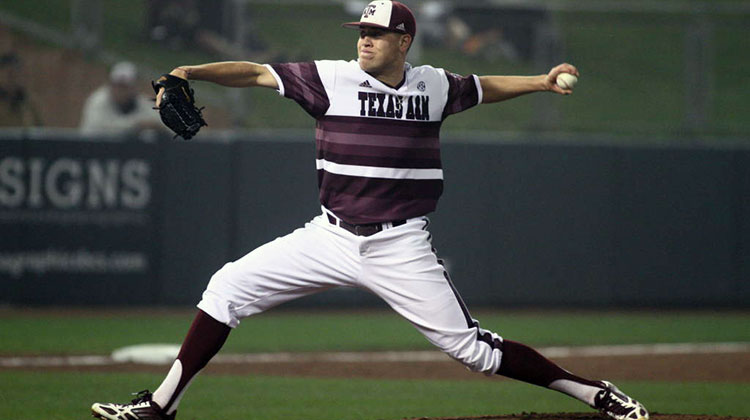
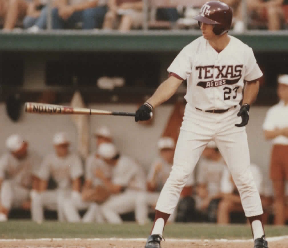
Curious to see what they are going to be this year. Has there already been an shoeing of these? Hope we ditched the little league t-shirts from last year. Would love to see them bring back the Texas Aggies in script in both maroon and white.


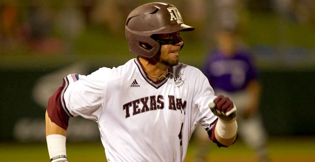
Additionally, someone made a mock last year of the uniform below which is awesome. I hope we get to see these in both maroon and white as well on the field sooner than later.

Bunk Moreland
How long do you want to ignore this user?
I hope as a group they aren't as bad as the last couple years.
Ag 11
How long do you want to ignore this user?
AG
Bring these back

Bunk Moreland
How long do you want to ignore this user?
I'll take these:


Bunk Moreland
How long do you want to ignore this user?
the never again list:


and any of last year's that had the small letters for Texas A&M and the last name. Also, get rid of the hats/helmets with white front/maroon back.

EMY92
How long do you want to ignore this user?
AG
I'd love the "Texas Aggies" to come back (like shown in the first picture), but the school doesn't want to be known as the Texas Aggies. It wants Texas A&M Aggies. I'm waiting for the administration to force the band to change the introduction at halftime of the football games.
Mr.Ackar07
How long do you want to ignore this user?
Maybe instead of a black sweep jersey on Sundays, they can have retro jersey Sundays

Farmer1906
How long do you want to ignore this user?
AG
I really liked last year's unis. The pullovers are the ****.
Bunk Moreland
How long do you want to ignore this user?
I was OK with them other than the stupid small letters of Texas A&M and the names. Made the jerseys look bad.
awschux
How long do you want to ignore this user?
AG
The pullover v-necks from 2015 looked horrifying and cheap. Its the type of t-shirt jersey you get when signing up for city league baseball in 7th grade. garbage.

Not ALL pullovers look like garbage. IN fact the two button henley pullovers that many schools use are awesome, see below.


OURS however were cheap looking t-shirts. The tiny letters sucked also, but no matter how big the letters were, they were still broke di ck 7th grade t-shirt city league jerseys. BLECH!!!!
ProudAg16
How long do you want to ignore this user?
AG
I agree. I really like the two-button pullovers. I also didn't mind our Friday nights last year, but maybe add a script Texas A&M font. That would be pretty sweet!
Farmer1906
How long do you want to ignore this user?
AG


I just wish we would stick with a font/style. I agree the 2 button look good, but the v neck is fine by me too.

The maroon camo needs to go though. Not a fan.
Farmer1906
How long do you want to ignore this user?
AG
Also not a fan of the postseason unis.


Farmer1906
How long do you want to ignore this user?
AG
Take a look at what adidas is putting out for 2016.

https://www.kevinsmithteamsports.com/TeamCatalogs/UniformsApparel/Adidas/2016Spring.aspx

Baseball starts on page 31. There is only one A&M pic and its on 51. It looks very similar to our postseason unis.

My favs
50 - Michigan
39 - Miss St (top 2)
Bunk Moreland
How long do you want to ignore this user?
oh no, those look bad. At least the Texas A&M is bigger again, but what is up with the two-tone armpit bull****.

Agree, Michigan looks good.
Bunk Moreland
How long do you want to ignore this user?
quote:
Also not a fan of the postseason unis.


yeah these are awful.
Sea Gull
How long do you want to ignore this user?
AG
God those are bad. I freaking hate Adidas
ProudAg16
How long do you want to ignore this user?
AG
Look to be the same as the postseason. Not a fan.
ProudAg16
How long do you want to ignore this user?
AG
The Indiana throwbacks on 48 are incredible!!
Bunk Moreland
How long do you want to ignore this user?
quote:
God those are bad. I freaking hate Adidas

Given they appear to have a ton of variety with the uni's, it looks like someone on the A&M side is deciding to choose those specific styles. No way Adidas tells A&M that's the style they have to wear.

Adidas has plenty in that catalog, and you'll see plenty of teams that will wear good looking Adidas uni's this year. Hope the Ags are one of em, but that catalog doesn't look promising
TheDoctor
How long do you want to ignore this user?
AG
Given current marketing, I don't see the script Texas Aggies coming back. Sadly. That said, I'd love a retro pinstripe look with the state of Texas logo on it or Texas A&M across the front. I think I like our retro pinstripe as much as the script Texas Aggies.
ABATTBQ87
How long do you want to ignore this user?
AG
could celebrate the 100th anniversary of the 1916 team:

Quinn
How long do you want to ignore this user?
AG


KaneIsAble
How long do you want to ignore this user?
AG
Ohhhhhh the bevel is blinding.....
trouble
How long do you want to ignore this user?
AG
Love the pinstripes

Hate that massive bevel
TheDoctor
How long do you want to ignore this user?
AG
Get the damn bevel outta here.
ProudAg16
How long do you want to ignore this user?
AG
The bevel isn't even that bad, the logo is just massive. Way too big.
src94
How long do you want to ignore this user?
AG
This is what I'd like to see too... Texas Aggies! Even if only as a retro. I'd buy one!
matt.maggio3
How long do you want to ignore this user?
AG
quote:
Has there already been an shoeing of these?
matt.maggio3
How long do you want to ignore this user?
AG
quote:
The bevel isn't even that bad, the logo is just massive. Way too big.
if the bevel was actually done correctly, it may not be as bad. however, they screwed it up and never fixed it.

http://texags.com/forums/5/topics/2049595/3
ProudAg16
How long do you want to ignore this user?
AG
quote:
quote:
The bevel isn't even that bad, the logo is just massive. Way too big.
if the bevel was actually done correctly, it may not be as bad. however, they screwed it up and never fixed it.

http://texags.com/forums/5/topics/2049595/3

Yes, I know the whole bevel argument, I've been around here long enough. But the bevel is here to stay so you have to get over it. I'm just saying a smaller logo would have looked better. Love the pinstripes!
matt.maggio3
How long do you want to ignore this user?
AG
agree on the pinstripes. I'd love to go back to the block T, but add pinstripes.
VickJD05
How long do you want to ignore this user?
AG
Bring back the Friday night off-whites!!!!!
jpc08
How long do you want to ignore this user?
AG
quote:
could celebrate the 100th anniversary of the 1916 team:


This is what they would end up looking like:


Probably a bad idea...
Refresh
Page 1 of 1
 
×
subscribe Verify your student status
See Subscription Benefits
Trial only available to users who have never subscribed or participated in a previous trial.